FORS2 trending system: HEALTH CHECK report
Last update: 2019-12-06T17:00:43 (UT)
[enable javascript for displaying time difference!]
Plot? Symb? Source Average ? Thresholds ? N_ QC1 Data Remarks
method value unit method value
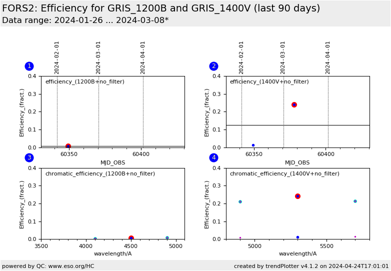
1
• QC1DB MEDIAN 0.175 NONE none 9 efficiency_3
this |
last_yr |
all
Relative efficiency for grism 1200B, no filter (upper CCD), range 4500A ; all lss_slit_pos are plotted here
2
• QC1DB MEDIAN 0.118 NONE none 4 efficiency_5
this |
last_yr |
all
Relative efficiency for grism 1400V, no filter (upper CCD), range 5300A ; all lss_slit_pos are plotted here
3
• QC1DB none NONE none 9 efficiency_1
this |
last_yr |
all
Chromatic efficiency plot for grism 1200B, no filter ; the values trended in plot are marked. The plot is constituted from the following wavelength ranges: 4500A
3
• QC1DB none NONE none 9 efficiency_2
this |
last_yr |
all
4100A
3
• QC1DB none NONE none 9 efficiency_3
this |
last_yr |
all
4500A
3
• QC1DB none NONE none 9 efficiency_4
this |
last_yr |
all
4900A
4
• QC1DB none NONE none 4 efficiency_4
this |
last_yr |
all
4
• QC1DB none NONE none 4 efficiency_5
this |
last_yr |
all
4
• QC1DB none NONE none 4 efficiency_6
this |
last_yr |
all
*Data sources: QC1DB: QC1 database; LOCAL: local data source
Plot 1 scores: data source: fors2_response dataset: efficiency_3 • median: 0.175 NONE thresholds: none N_data plotted: 9 [click plot for closeup]
Plot 2 scores: data source: fors2_response dataset: efficiency_5 • median: 0.118 NONE thresholds: none N_data plotted: 4 [click plot for closeup]
Plot 3 scores: data source: fors2_response dataset: efficiency_1 • average: none thresholds: none N_data plotted: 9 [click plot for closeup]
Plot 4 scores: data source: fors2_response dataset: efficiency_4 • average: none thresholds: none N_data plotted: 4 [click plot for closeup]
This plot
General information
Click on any of the plots to see a close-up version .
The latest date is indicated on top of the plot.
If configured,
data points belonging to the latest date are specially marked statistical averages are indicated by a solid line, and thresholds by broken lines outliers are marked by a red asterisk. They are defined as data points outside the
threshold lines "aliens" (= data points outside the plot Y limits) are marked by a red arrow (↑ ↓ you can download the data for each parameter set if the 'Data downloads' link shows up
