|
|
*Date on this monitor changes at 21:00 UT |

| Print: | Information and research: |
| - png file |
- advanced studies:
QC1 browser |
QC1 plotter |
| Plot [info] |
Symbol [info] |
Source* | Average [info] | Thresholds [info] | N_data | Data downloads | Remarks | ||||
| method | value | unit | method | value | |||||||
| 1 | • | QC1DB | MEDIAN | 0.175 | none | none | 35 | this | last_yr | all | efficiency at 6500A | ||
| 2 | • | QC1DB | MEDIAN | 0.187 | none | none | 35 | this | last_yr | all | efficiency at 6500A | ||
| 3 | • | QC1DB | MEDIAN | 0.179 | none | none | 31 | this | last_yr | all | efficiency at 6500A | ||
| 4 | • | QC1DB | MEDIAN | 0.195 | none | none | 32 | this | last_yr | all | efficiency at 6500A | ||
| *Data sources: QC1DB: QC1 database; LOCAL: local text file | |||||||||||
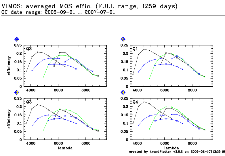
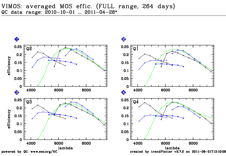
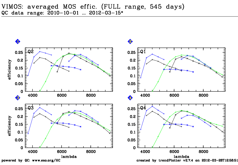
Trending plot for the overall MOS efficiency, measured using spectrophotometric standard stars.
The following settings are used:
LR_blue grism + OS-blue filter
LR_red grism + OS-red filter
MR grism + GG475 filter
HR_blue grism (without filter)
HR_orange grism + GG435 filter
HR_red grism + GG475 filter
The thresholds for scoring are set for monitoring the quality of the individual calibration. Outliers could indicate that the measurement was done through (thin) clouds or that the star was not correctly centered on the slit. Such measurements should be repeated.
A new HR_blue grism has been installed in March 2012. The plots for HR_blue show the efficiency at 5700A until 2011. From 2012 onwards, these plots are for the efficiency at 4500A.
Template ID: mos_cal_Specphot. Pipeline recipe: vmmosstandard.
Plots that show the efficiency vs. wavelength have been created by averaging
several standard star measurements. They show the efficiency
before
and
after
the 2010 instrument upgrade. Measurements with the new HR_blue grism from
March 2012 are included
here.
Click on any of the plots to see a close-up version.
The latest date is indicated on top of the plot, data points belonging to that date are specially marked. If configured,
General information