Plot
? |
Symb
? |
Source
* |
Average ? |
Thresholds ? |
N_
data |
QC1
parameter |
Data
downloads |
Remarks |
| method |
value |
unit |
method |
value |
| 1 |
□ | LOCAL |
none |
|
number |
none | |
111 |
all_red |
n/a |
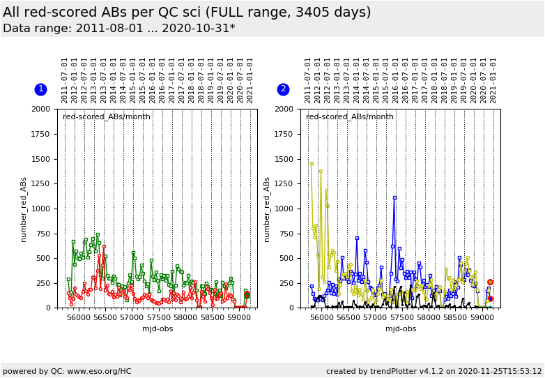
Red-score CALIB ABs per QC scientist. QC1 |
| 1 |
o | LOCAL |
none |
|
number |
none | |
111 |
all_red |
n/a |
QC2 |
|
| 2 |
□ | LOCAL |
none |
|
number |
none | |
111 |
all_red |
n/a |
QC3 |
| 2 |
o | LOCAL |
none |
|
number |
none | |
111 |
all_red |
n/a |
QC4 |
| 2 |
• | LOCAL |
none |
|
number |
none | |
111 |
all_red |
n/a |
QC5 |
| |
|
*Data sources: QC1DB: QC1 database; LOCAL: local data source
|
| Plot 1 | | data source: | local data source
|
dataset:
(numbers below apply to this dataset) | all_red | □ |
| average: | none |
| thresholds: | none |
| N_data plotted: | 111 |
| [click plot for closeup] |
| Plot 2 | | data source: | local data source
|
dataset:
(numbers below apply to this dataset) | all_red | □ |
| average: | none |
| thresholds: | none |
| N_data plotted: | 111 |
| [click plot for closeup] |
This plot visualizes the total monthly number of
red-scored calibration ABs per QC scientist. These ABs require an issue analysis
and a comment. These numbers thereby measure a significant aspect of the daily
workload.
Note: The latest data point in the current plot usually refers to a month which is not yet finished.
Its value will therefore continue to increase until a new last month starts.
General information
Click on any of the plots to see a close-up version.
The latest date is indicated on top of the plot.
If configured,
- data points belonging to the latest date are specially marked
- statistical averages are indicated by a solid line, and thresholds by broken lines
- outliers are marked by a red asterisk. They are defined as data points outside the
threshold lines
- "aliens" (= data points outside the plot Y limits) are marked by a red arrow (↑ or ↓)
- you can download the data for each parameter set if the 'Data downloads' link shows up
|
