Plot
? |
Symb
? |
Source
* |
Average ? |
Thresholds ? |
N_
data |
QC1
parameter |
Data
downloads |
Remarks |
| method |
value |
unit |
method |
value |
| 1 |
o | QC1DB |
none |
|
number |
none | |
110 |
N_AB_CERTIF |
all (full time range)
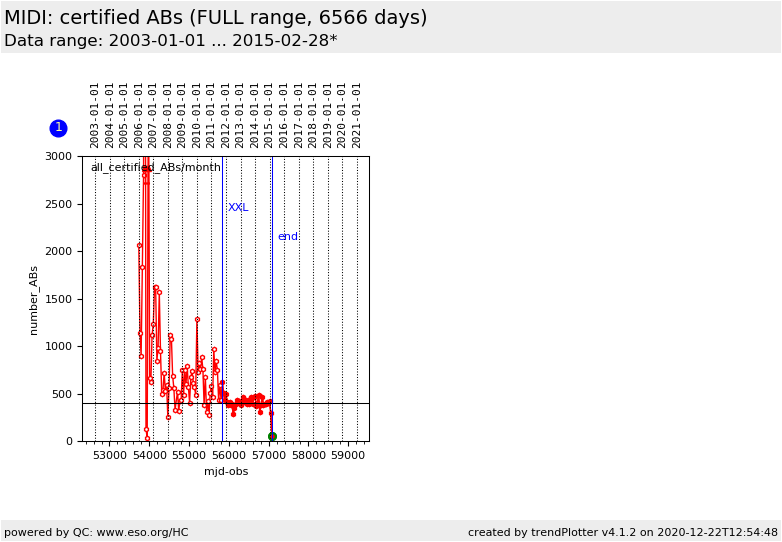
| All processed and certified ABs per month (before 2011-10: CAL+SCI) |
| 1 |
• | QC1DB |
MEAN |
409 |
number |
none | |
42 |
N_AB_CERTIF |
all (full time range)
| same, after 2011-10: CAL (AVERAGE applies to this dataset) |
| |
|
*Data sources: QC1DB: QC1 database; LOCAL: local data source
|
| Plot 1 | | data source: | monthly_AB_certif
(QC1 database) |
dataset:
(numbers below apply to this dataset) | N_AB_CERTIF | o |
| average: | none |
| thresholds: | none |
| N_data plotted: | 110 |
| [click plot for closeup] |
This plot visualizes the monthly statistics of certified ABs.
In contrast to the 'AB_processing'
plots it collects real ABs, as they appear on the AB monitor.
Collected are:
- the number of all certified ABs (successfully executed and scoring green or red)
(before XXLight: successful CAL+SCI; with XXLight: successful CAL).
The AB numbers refer to real ABs and are lower by a factor MEF_FACTOR
(for MEF instruments)
than the number of det.ABs as counted on the AB_processing pages.
The numbers here measure the interactive and configuration
workload (e.g. the number of ABs to score, certify and associate).
The history before 2004-01 is not well explored and likely to be incomplete.
The change of the operational model to the current 'XXLight' is marked.
Note: The latest data point in the current plot usually refers to a month which is not yet finished.
Its value will therefore continue to increase until a new last month starts.
General information
Click on any of the plots to see a close-up version.
The latest date is indicated on top of the plot.
If configured,
- data points belonging to the latest date are specially marked
- statistical averages are indicated by a solid line, and thresholds by broken lines
- outliers are marked by a red asterisk. They are defined as data points outside the
threshold lines
- "aliens" (= data points outside the plot Y limits) are marked by a red arrow (↑ or ↓)
- you can download the data for each parameter set if the 'Data downloads' link shows up
|
