Software Components
Data Transfer
Publisher / Subscriber Libraries
The Data Transfer component contains a dynamic library which is the DDT Data Transfer Library. It contains the classes required to create a Publisher or a Subscriber object that can be embedded in custom applications. They are also used in DDT simulator tools which can be used as Subscriber or Publisher.
The library is built as a single .so file: libddt-transfer.so
Due to the similarity of the features required by the Publisher and Subscriber library, these objects were placed in a single library.
Publisher library functions
When using the Data Transfer library to create a publisher, the following functions are available:
Function |
Arguments |
Return type |
Description |
|---|---|---|---|
Create Publisher |
DdtLogger* logger |
static std::unique_ptr <DdtDataPublisher> |
Creates an instance of the DdtDataPublisher. An instance of the DdtLogger object is given, if logging is required. |
Create Publisher |
log4cplus::Logger const& log4cplusLogger |
static std::unique_ptr <DdtDataPublisher> |
Creates an instance of the DdtDataPublisher. An instance of the log4cplus logger object is given. Note that in this case, the initialization and shutdown of the log4cplus must be done by the caller. |
Function |
Arguments |
Return type |
Description |
|---|---|---|---|
SetQoS |
int latency (in ms), int deadline (in ms) |
Sets the QoS parameters for the MAL connections. |
|
SetBufferSize |
int max_data_sample_size, int number_of_samples |
Set the size hint for the data to be published. The size is made up of the maximum size in bytes required for one Data Sample and the number of samples that shall be stored in the ring buffer. |
|
RegisterPublisher |
string broker_uri, string data_stream_identifier, bool compute_checksum |
int (-1 if registering fails) |
Registers a Stream Data with the given Data Stream ID at the local broker with the given URI. A flag can be used to switch the calculation of a checksum for the Data Samples that are transferred on or off. Returns an error code. |
UnregisterPublisher |
Unregisters the DDT Data Publisher from the local Data Broker. |
||
WriteData |
int32_t sample_id, ip::vector<uint8_t> datavec, ip::vector<uint8_t> metadata |
Writes data to the shared memory using a Memory Accessor. |
|
WriteData |
const int32_t sample_id, const uint8_t *const data, const int32_t data_size, const uint8_t *const metadata, const int32_t metadata_size |
Writes the data packet into shared memory using a memory accessor. The data is passed as a pointer. |
|
PublishData |
Notifies the local Data Broker that it shall publish new data by sending the corresponding event. |
||
set_topic_id |
int topic_id |
Sets the topic ID for the publisher. |
|
get_connected_to_broker |
Bool |
Return true, if the publisher is connected to a Data Broker. |
Subscriber library functions
When using the Data Transfer library to create a subscriber, the following functions are available:
Function |
Arguments |
Return Type |
Description |
|---|---|---|---|
CreateSubscriber |
DdtLogger* logger |
static std::unique_ptr <DdtDataSubscriber> |
Creates an instance of the DdtDataSubscriber. An instance of the DdtLogger object is given, if logging is required. |
CreateSubscriber |
log4cplus::Logger const& log4cplusLogger |
static std::unique_ptr <DdtDataSubscriber> |
Creates an instance of the DdtDataSubscriber. An instance of the log4cplus logger object is given. Note that in this case, the initialization and shutdown of the log4cplus must be done by the caller |
Function |
Arguments |
Return Type |
Description |
|---|---|---|---|
SetQoS |
int latency (in ms), int deadline (in secs) |
Sets the QoS parameters for the MAL connections. |
|
RegisterSubscriber |
string broker_uri, string data_stream_identifier, string remote_broker_uri, string reading_interval (default is 10 ms) |
int (-1 if registration fails) |
Registers to a Data Stream with the given Data Stream ID at the local Data Broker with the given URI. For remote Subscribers the URI to the remote Broker needs to be specified. Returns an error code. Reading interval can be used to simulate slow readers. The argument is optional Default interval will be 10 ms. |
UnregisterSubscriber |
Unregisters the DDT Data Subscriber at the local Data Broker |
||
ReadData |
DataSample* data_sample |
Read data from the shared memory of local Data Broker |
|
StartNotification Subscription |
Starts MAL subscription for n otifications in a separate thread. |
||
StopNotification Subscription |
Stops MAL subscription for notifications |
||
connect |
const signal_t::slot_type& e=event_listener |
boost::signals2:: connection |
Connects the event listener with the DataAvailableSignal from the memory accessor. |
get_statistics |
DdtStatistics |
Returns the statistics computed by the DataBroker. |
The function get_statistics() returns a struct of type DdtStatistics
which has the following structure:
struct DdtStatistics {
    /**
     * Time of the last received data packet
     */
    std::chrono::system_clock::time_point last_received;

    /**
     * Time of the last received data packet as string
     */
    std::string last_received_str = "";

    /**
     * Number of connected subscribers
     */
    int32_t num_subscribers = 0;

    /**
     * Total number of received samples
     */
    uint64_t total_samples = 0;

    /**
     * Total number of received bytes
     */
    uint64_t total_bytes = 0;

    /**
     * Total latency of the data transfer [ms]
     */
    uint64_t total_latency = 0;

    /**
     * Queue capacity (number of elements in the ring buffer)
     */
    int32_t queue_capacity = 0;

    /**
     * Originating broker
     */
    std::string originating_broker = "";
};
This struct contains the raw values provided as simple counters.
Counters are updated for each Data Sample received by a Data Broker over
the network, and a timestamp is stored when the counters were updated.
The data type of the timestamp is std::chrono::system_clock::time_point,
but it is also provided as a std::string for convenience. With the help
of the counters, clients can perform their own calculation of averages
like the average sample frequency or the average latency.
The latency is defined as follows:
In the local case it is the time difference of the data sample written into shared memory and the time the data broker was notified from the publisher about new data.
In the remote case it is the time difference of the data sample written into shared memory and the time the remote broker received the data sample via network.
Furthermore, the queue capacity (which is the number of elements in the ring buffer) and the URI of the originating Data Broker are provided.
Data Brokers update the statistic counters whenever a new data notification is received from a Publisher. In the case a remote Subscriber is requesting the statistics, its Data Broker is updating the statistics whenever a Data Sample is received over the network from the remote Data Broker.
Configuration
It is possible to set some parameters of the DDT Data Transfer Library
via a configuration file. This file is called datatransfer.ini and is
copied to a config folder when the command waf install is executed (see
section 3.2). The config folder is specified in the
DDT_TRANSFERCONFIG_PATH environment variable which is set in the
private.lua file. The file datatransfer.ini is structured as follows:
[datatransferlib]
max_age_data_sample=10000
reply_time=6
The first line specifies a name which simply groups the following lines
into a section ([datatransferlib] in this case). This line should not be
altered by the user.
The subsequent lines contain the parameters which can be configured. The parameters consist of a name and a value delimited by an equal sign. Currently the user can configure two parameters:
Parameter |
Description |
|---|---|
max_age_data_sample |
Specifies the maximum age of a data sample in [ms]. This parameter is read from the DdtDataSubscriber and will drop a data sample if it is older than the age specified here. Data samples are dropped directly after they were read from the shared memory. Note: The sample is not removed from the shared memory. The data is kept until it is overwritten by the publisher. |
reply_time |
Specifies a request timeout in [s]. This parameter is read from the DdtDataPublisher and sets the reply time of a MAL client instance. The reply time should only be increased if one expects a high response time from the Data Broker, which would be the case e.g. for transferring high resolution images. |
Data Broker
The Data Broker is a command line application which is used to transfer the data from the Publisher to the Subscriber either on the same or on different hosts. When running the setup on different hosts, a single Data Broker needs to be started on each of the hosts.
The Data Broker can be started using the command line:
ddtBroker -U <Server URI of the broker> -o <configuration file> [--debug]

ddtBroker --uri <Server URI of the broker> --config_file <configuration file> [--debug]
An example for this would be:
ddtBroker --uri zpb.rr://*:5001
Once the broker is running, local Publishers can connect to it. On the Subscriber side the Subscriber will connect to its local Data Broker and the Broker will then create the connection to the remote Broker running on the Publisher host.
Typically, there will be several Data Brokers in the network. However, there will be no kind of Data Broker discovery mechanism, since subscriber applications know whom to connect to. Subscriber applications just pass the URI to remote Data Brokers as a parameter to their local Data Broker, so the local Data Broker can then connect to the remote Data Broker running on the machine where the Publisher is running.
The URI which needs to be specified is the URI on which local services (Publisher or Subscriber) can connect to the Data Broker. The URI consists of the protocol (e.g. zpb.rr), the host (e.g. *) and the port (e.g. 5001).
The --config_file parameter is optional. If this parameter is not
specified by the user, a default configuration file is used (see below).
This parameter can be used to specify a different file which allows to
run multiple Data Brokers on the same host with different
configurations. If a specified file is invalid or does not exist, the
Data Broker reports a warning and uses the default configuration
instead.
The --debug flag can be used to temporarily increase the log level of
the Data Broker to DEBUG.
The Data Broker also supports the command line argument:
ddtBroker --help
Pressing CTRL+C stops the Data Broker. In the case there are Publishers
and Subscribers registered to the Data Broker, they get unregistered
(and notified). If the Data Broker is restarted, Publishers and
Subscribers get a notification and register again automatically.
The Data Broker uses a configuration file which can be used to configure the timeout behaviour and the network port range of the Data Broker.
The file will be deployed to:
"$DDT_TRANSFERCONFIG_PATH/databroker.ini"
DDT_TRANSFERCONFIG_PATH is the environment variable which is set in the private.lua file.
The file contains the following settings in the section [databroker]:
Parameter |
Description |
|---|---|
shm_timeout |
The shm_timeout (in seconds) specifies the time after which the Data Broker deletes an allocated shared memory after a publisher was unregistered and when there are no more subscribers registered. The shared memory will otherwise be re-used, if the Publisher re-registers within this timeout. |
waiting_time |
Time in ms that the MAL publishers may use for establishing the communication. If the time is exceeded the connection attempt fails. |
min_port |
Minimum port number for the port range the Data Broker may use. Ports will be automatically assigned for communication between Publishers / Subscribers and the Data Broker for non-data exchange (notifications). |
max_port |
Maximum port number for the port range the Data Broker may use. Ports will be automatically assigned for communication between Publishers / Subscribers and the Data Broker for non-data exchange (notifications). |
reply_time |
Time in seconds used to establish a connection to a MAL server. If the time is exceeded the connection attempt fails. |
heartbeat_interval |
Interval in seconds for the heartbeat which is used to monitor the status of the connection between Data Broker and Subscriber/Publisher. By setting the heartbeat interval to 0 the heartbeat is deactivated for all Subscribers/Publishers that connect to the Data Broker. |
heartbeat_timeout |
Timeout in seconds for the heartbeat. If no heartbeat signal was received for the configured time the MAL client (Publisher or Subscriber) is unregistered. |
Publisher Simulator
The Publisher Simulator is an example for a publishing application that uses the DDT Publisher Library.
For now, the Publisher Simulator will send the content of FITS files or simulation data. In a later implementation it can either be used to publish data from files or data from a binary dump of a Data Stream.
The Publisher Simulator is a command line tool. It can be started using the following arguments:
ddtPublisherSimulator --broker <local broker URI> --datastream <data
stream ID> --interval <publishing interval> --mode <simulation-mode>
--image_folder <folder to FITS images> --buffer_size <ring buffer
elements> --checksum <checksum flag> [--debug]

ddtPublisherSimulator -b <local broker URI> -s <data stream ID> -f
<publishing interval> -m <simulation-mode> -i <folder to FITS images> -u
<ring buffer elements> -c <checksum flag> [-d]
An example of the command looks like this:
ddtPublisherSimulator --broker zpb.rr://127.0.0.1:5001 --datastream ds1
--interval 1000 --mode 1 --image_folder /data/fitsimages/rotate
--buffer_size 10 --debug
The arguments are used to specify the following items:
–broker |
Allows to configure the URI to the local broker (required) |
–datastream |
Defines the Data Stream ID which is used for publishing data (required) |
–interval |
Publishing interval in ms for publishing of data samples |
–buffer_size |
Size of the ring buffer, defaults to 4 elements, if not specified |
–image_folder |
Folder containing FITS images (should be of same type/size) |
–mode |
Optional, defaults to 1. The following modes are supported for testing: |
Mode 1: Transfer of FITS images from the folder –image_folder |
|
Mode 2: Oscilloscope use-case: Transfer of single dimensional array |
|
Mode 3: Multidimensional Array use-case: Transfer of multi-dim. array |
|
Mode 4: Configurable Map test scenario |
|
Mode 5: Chunked image test scenario |
|
Mode 6: Transfer of 16 bit unsigned data |
|
Mode 7: Transfer of 32 bit unsigned data |
|
–checksum |
Flag, to switch on/off the checksum calculation (defaults to 1, true) |
–debug |
Temporarily increases the log level to DEBUG |
–help |
Gives an overview of the above listed options |
Note that the path element of the --broker parameter (/broker/Broker1 in
the example above) is optional. If not specified by the user, this
string is automatically appended.
The different modes can be used to test different use-cases. In mode 1 it is important to select a folder for image files (default is the current directory). The modes 2 and 3 can only be used in combination with a Subscriber Simulator. The modes 4, 5, 6 and 7 can only be used with a DDT Standard Viewer. Mode 1 can be used with both the Subscriber Simulator and the viewer.
When running the Publisher Simulator in mode 4 the connected DDT
Standard Viewer will make use of a so called “Configuration Map”. These
maps are stored in FITS format in the directory specified in
$DDT_CONFIGURATIONMAP_PATH.
The definition for which configuration map is loaded depends on the meta data of the image. For detailed information on the configuration map handling, please refer to section 3.3.5.
When running the Publisher Simulator in mode 5 it will generate chunks of images with the proper metadata also generated. Each chunk of the image will contain in its meta-data the proper x-y coordinates where this chunk is placed into the full image. Also, the last chunk has the “final” flag set in its metadata. The meta-data also contains a “complete” flag. This is used to determine between chunked images and images that are not chunked.
The modes 6 and 7 will generate a data stream consisting of data that cover the range for 16 rsp. 32 bit unsigned data, with the first value (image coordinate 1 / 1) set to 0 and the last value (image coordinate width / height) set to a value near the maximum possible value for the data type in question. The data type is specified in the meta data.
Pressing CTRL+C unregisters the Publisher Simulator from its Data Broker and stops the Simulator. If the connection to the Data Broker was lost, Publishers get a notification and automatically resume publishing as soon as the connection was re-established.
Subscriber Simulator
The Subscriber Simulator is similar to the Publisher Simulator. It can be used to demonstrate the implementation of the DDT Subscriber Library.
The Subscriber Simulator is a command line tool that can be started like this:
ddtSubscriberSimulator [--remote <remote broker URI>] --broker <local
broker URI> --datastream <data stream ID> --interval <reading period in
ms> --mode <simulator mode> [--statistics <0|1>] [--dump_data <0|1>]
[--dump_folder<folder specification>] [--debug]

ddtSubscriberSimulator [-r <remote broker URI>] -b <local broker URI> -s
<data stream ID> -v <reading period in ms> -m <simulator mode> [-a
<0|1>] [-p <0|1>] [-f <folder specification>] [-d]
An example of the command looks like this:
ddtSubscriberSimulator --broker zpb.rr://127.0.0.1:5001 --datastream ds1
--mode 1 --debug
The arguments are used to specify the following items:
–broker |
URI of the local broker (required) |
–datastream |
Data Stream ID for which to subscribe (required) |
–interval |
Reading interval in ms (can be used to simulate a slow reader, default 10) |
–remote |
URI of a remote broker, only used for multi-host scenarios |
–mode |
Simulation mode. Optional, defaults to 1. The following modes exist: Mode 1: Receiving of images in FITS format |
Mode 2: Oscilloscope use-case: Receiving of single dimensional array |
|
Mode 3: Multidimensional Array use-case: Receiving of multi-dim. array |
|
–statistics |
Flag to switch off or on the calculation of transfer statistics (default off) |
–dump_data |
Flag to switch off or on the dumping of the incoming data stream into FITS files (default off). This flag is only considered in simulation mode 1. |
–dump_folder |
Specification of folder to dump the FITS files to when the dump_data flag is set (default: /tmp) |
–debug |
Temporarily increase the log level to DEBUG |
–help |
Show the available options |
When the Subscriber is using data from the local host, the --remote
argument is not required, it is optional in this case. When the
Publisher is on a remote host, the --remote argument needs to be the URI
of the remote Broker.
Note that the URI of the --broker and --remote parameters must not
include any path elements. The URI only consists of the protocol (e.g.
zpb.rr), the host (e.g. 127.0.0.1) and the port (e.g. 5001).
When started in mode 1, it is possible to store the received data in
FITS files. To do this, the option -–dump_data has to be provided with a
value of 1. In addition, it is then possible to specifiy the folder
where the FITS files are stored using the -–dump_folder option. When not
set, the folder defaults to “/tmp”. The created FITS files are named as
follows: <timestamp>_subscriber_dump.fits, where <timestamp> is the UTC
timestamp taken from the meta data of the data package.
Pressing CTRL+C unregisters the Subscriber Simulator from its local Data
Broker and stops the Simulator. If the Data Broker or the Publisher was
stopped, Subscribers get a notification and automatically subscribe
again as soon as the connection is re-established.
Another example for a Subscriber application is the DDT Standard Viewer, which will be described in the following section.
Publish Data from a Snapshot
In order to publish data from a previously recorded snapshot, the following procedure can be used:
Use the Subscriber Simulator (see 3.3.1.1.5) with the
--dump_dataand--dump_folderoptions to store the received data stream into FITS files. Use a newly created or an empty--dump_folderfor this purpose. Note that the specified dump folder must exist.After stopping the Subscriber Simulator, make a compressed archive from the dump folder by executing:
tar –czf <snapshot_file.tgz> <dump_folder>In order to publish the stored snaphot, unpack the tgz snapshot file, by executing:
tar –xzf <snapshot_file.tgz>Start a Publisher Simulator (see 3.3.1.1.4) to start a data transfer in mode 1, providing the previously unpacked data folder as
--image_folderargument.
Meta-Data Definition
For the encoding/decoding of meta-data encoder/decoder classes exist. These make use of a meta-data definition for different data types: image data with 2 dimensions, image data with 3 dimensions and multi-array data with x dimension.
The related classes are derived from a single base class. The base class offer the following methods:
class DdtEncDec {
public:

    /**
     * Constructor
     */
    explicit DdtEncDec();

    /**
     * Destructor
     */
    virtual ~DdtEncDec() = 0;

    /**
     * Sets the meta data length
     */
    virtual void setMetaDataLength(const int mdl);

    /**
     * Sets the topic ID
     */
    void setTopicId(const int ti);

    /**
     * Returns the meta data length
     */
    virtual int getMetaDataLength();

    /**
     * Returns the topic ID
     */
    virtual int getTopicId();

    /**
     * Returns the bytes_per_pixel member
     */
    virtual uint32_t getBytes_per_pixel() const;

    /**
     * Returns the number_dimensions member
     */
    virtual uint32_t getNumber_dimensions() const;

    /**
     * Returns the utc_timestamp member
     */
    virtual std::string getUtc_timestamp() const;

    /**
     * Returns the complete_flag member
     */
    virtual bool getComplete_flag() const;

    /**
     * Returns the last_segment member
     */
    virtual bool getLast_segment() const;

    /**
     * Returns the byte_order_little_endian member
     */
    virtual bool getByte_order_little_endian() const;

    /**
    * Return the data_type member.
    */
    virtual uint32_t get_data_type() const;

    /**
    * Return data_type member value as a string.
    */
    virtual std::string get_data_type_str() const;

    /**
     * Returns the description member
     */
    virtual std::string getDescription() const;

    /**
     * Returns the reference_point_x member
     */
    virtual float getReference_point_x() const;

    /**
     * Returns the reference_point_y member
     */
    virtual float getReference_point_y() const;

    /**
     * Returns the ra_reference_point member
     */
    virtual float getRaReference_point() const;

    /**
     * Returns the dec_reference_point member
     */
    virtual float getDecReference_point() const;

    /**
     * Returns the arcsec_pixel_x member
     */
    virtual float getArcSec_pixel_x() const;

    /**
     * Returns the arcsec_pixel_y member
     */
    virtual float getArcSec_pixel_y() const;

    /**
     * Returns the rotation_x_axis member
     */
    virtual float getRotation_x() const;

    /**
     * Returns the cd1_1 member
     */
    virtual float getCd1_1() const;

    /**
     * Returns the cd1_2 member
     */
    virtual float getCd1_2() const;

    /**
     * Returns the cd2_1 member
     */
    virtual float getCd2_1() const;

    /**
     * Returns the cd2_2 member
     */
    virtual float getCd2_2() const;

    /**
     * Returns the epoch_equinox member
     */
    virtual float getEpochEquinox() const;

    /**
     * Returns the type 1 projection member
     */
    virtual std::string getType_1() const;

    /**
     * Returns the type 2 projection member
     */
    virtual std::string getType_2() const;

protected:
    /**
     * Returns the current time including milliseconds
     */
    std::string getCurrentTime() const;

    // The topic ID is used to distinguish meta data shapes from each other
    int topicId = 0;

    // The length of the meta data block
    int metaDataLength = 0;
};
Additional derived classes exist:
DdtEncDecImage2D
DdtEncDecImage3D
DdtEncDecBinaryxD
These derived classes offer getters for the related meta-data field defined for those data types.
The meta-data is grouped into structs. The base meta-data includes the following elements:
struct MetaDataBase {
    uint32_t bytes_per_pixel;
    uint32_t number_dimensions;
    std::string utc_timestamp;
    bool complete_flag;
    bool last_segment;
    bool byte_order_little_endian;
    uint32_t data_type;
    std::string description;
};
struct WcsInformation { float reference_point_x; float reference_point_y; float ra_reference_point; float dec_reference_point; float arcsec_pixel_x; float arcsec_pixel_y; float rotation_x_axis; float cd1_1; float cd1_2; float cd2_1; float cd2_2; float epoch_equinox; std::string type_1; std::string type_2; };
The struct WcsInformation is required by 2D and 3D images to calculate WCS coordinates.
The derived data types contain some additional information:
Meta-Data for 2D image data
struct MetaDataElementsImage2D {
    MetaDataBase meta_data_base;
    uint32_t number_pixels_x;
    uint32_t number_pixels_y;
    int32_t binning_factor_x;
    int32_t binning_factor_y;
    uint32_t first_pixel_x;
    uint32_t first_pixel_y;
    uint32_t number_chunks_x;
    uint32_t number_chunks_y;
    uint32_t image_id;
    WcsInformation wcs_info;
};
Meta-Data for 3D image data
struct MetaDataElementsImage3D {
    MetaDataBase meta_data_base;
    uint32_t number_pixels_x;
    uint32_t number_pixels_y;
    int32_t binning_factor_x;
    int32_t binning_factor_y;
    uint32_t number_layers;
    uint32_t item_size;
    WcsInformation wcs_info;
};
Meta-Data for multi dimensional arrays
struct MetaDataElementsBinaryxD {
    MetaDataBase meta_data_base;
    std::string array_dimensions;
    std::string configuration_map_name;
    std::string labels;
};
More information on the meta-data definition can be found in the Design Description [DD] in section 3.1.6.
Data Visualisation
DDT Widgets
The DDT Widgets library contains several widgets that are implemented as
Qt Designer Plugins which can be used in the Qt Creator/Designer to
build custom GUI applications. The widget library is made up of a shared
library library (libddt-widgets.so) that contains the widget code and
the plugins module (libddt-plugins.so) which is needed by the QT
Creator/Designer.
All supported widgets are contained in a single shared library.
The central widget of the widget library is the Image Widget. The Image Widget can be used to display data either loaded from a FITS file or received via the Data Transfer.
Further auxiliary widgets are available in the library, but all of them are basically connected to one instance of the Image Widget. Note: All signals of the auxiliary widgets have the Image Widget as target while all slots have the Image Widget as source.

Fig. 2 DDT Standard Viewer with DDT Widgets
The DDT Widgets all implement the interface of the
QDesignerCustomWidgetInterface.
All widgets basically offer a CreateWidget method that will return a
pointer to a QWidget object that can be used to access the object.
A code example for such a CreateWidget method looks like this:
void DdtPanningWidget::CreateWidget() {
    // Create all widget elements
    QHBoxLayout *layout = new QHBoxLayout;

    preview_image_label = new QLabel();
    preview_image_label->setAlignment(Qt::AlignCenter);
    layout->addWidget(preview_image_label);

    // get the widget from base class and put it together to the surface
    setWidget(DdtWidget::AddParentWidget(layout));

    // Connect actions
    preview_image_label->setMouseTracking(true);
    preview_image_label->installEventFilter(this);

    // Flag for enabling/disabling the display of the compass
    show_axes = false;
    rotation_deg = -1.0;
}
All widgets are using a base layout which is added by using the
addParentLayout(QLayout\* child_layout) method call. The base layout
for example will create a box surrounding the widget component.
Image Widget
The Image Widget is used to display image data that either comes from a file or from a Data Publisher. In the current version the Image Widget can be used to display images in JPEG and FITS format.
Some properties of the Image Widget can be set as properties in the Qt Designer. These are:
Property |
Default |
Description |
UseOpenGL |
false |
This flag allows enabling or disabling of OpenGL for the image display. |
UseAntialiasing |
false |
This flag allows enabling or disabling of Antialiasing for the image display. |
AutoScale |
false |
When set to true images will automatically be scaled to match the size of the Image Widget when loaded. |
DefaultScale |
1/2 |
This is the default scale which is selected when pressing the “Default scale” button in the related auxiliary widgets or that is used when loading a new image (and the auto scale flag is set to false). |
ScaleFactorList |
1/16, 1/12, 1/8, 1/6, 1/4 , 1/2, 1, 2, 4, 6, 8, 12, 16, 20 |
The list of scale values that can be used by the various widgets that control the image scale. List of comma separated values. |
DefaultColouramp |
real |
Default colourmap that should be loaded (if not available the images will be) using black/white colours |
ListContextMenu Menu |
A list of Dialog ID can be given (see Dialog section). The dialogs will be added to the context menu of the image widget. When the list is left empty, all supported dialogs will be offered in the context menu. |
|
DefaultBiasImage |
/data/fitsimages/ default_bias_image .fits |
Path to the default bias image, which will automatically be applied to images. If the image or the path do not exist, then no bias image is applied by default. |
ShowScrollbars |
true |
Flag indicating if scrollbars should be shown, when the image size exceeds the size of the Image Widget. |
The Image Widget offers a number of public methods:
Function Name |
Return Type |
Arguments |
Description |
|---|---|---|---|
ActivateTimestampDisplay |
void |
Activates debug output of the data sample timestamp in the image. |
|
AddRenderingPlugins |
void |
DdtRenderingPlugin* const new_plugin |
This function can be called to add a new rendering function into the Image Widget. Additional rendering functions can be used to render image data in different ways. |
CloseAllDialogs |
void |
Closes all open dialogs. |
|
ConvertCanvasToImage |
void |
const double x_canvas, const double y_canvas, double* x_image, double* y_image |
Converts the x,y canvas coordinates to image coordinates (returned by reference). |
ConvertImageToCanvas |
void |
const double x_image, const double y_image, double* x_canvas, double* y_canvas |
Converts the x,y image coordinates to canvas coordinates (returned by reference). |
CutLevelChanged |
void |
Handling the change of cut levels. |
|
EndMarkPosition |
QString |
Ends the marking of position in the image and returns the list of selected points as a string. |
|
FetchDialogName |
QString |
const QString |
Fetches the name of a dialog with a given dialog ID. The name can be used e.g. in the context menu. |
HandleNewBoostDataEvent |
void |
Handles event coming from the data transfer library informing about the availability of new data. |
|
InitializeDialogMap |
void |
QMap<QString, DdtDialog*> insert_map |
Initialize the map of dialogs which can be called from the Image Widget. A map of dialogs is given as argument. The map contains the dialog objects indexed by the dialog IDs. |
MarkPositions |
void |
Start marking positions in the image. |
|
ParseFractionString |
float |
QString fraction_str |
Parse the string representation of a fraction to a floating point value. E.g. 1/4 is converted to 0.25. |
ProcessRemoteCommand |
void |
const std::string& command_name |
Called when processing a remote command. Arguments contain the command name and a vector of strings holding the command arguments. |
Register LastSegmentCallback |
void |
const std::function<void()> &lastSegmentFunction |
Registers a function to be called when the last segment of a segmented image arrives. |
ReloadGraphicsItem |
void |
Reloads the graphics items into the scene. |
|
SetActive RenderingPlugin |
void |
const int rendering_plugin_id |
Selects the active rendering plugin id. The activated rendering plugin will be used for rendering new data. |
SetOverlayImageFile |
void |
const QString &overlay_file |
Adds a (transparent) png file as overlay. |
SortedScaleFactors |
QList<QString> |
QMap<QString, float> scale_map |
Returns a sorted list of scale factors. The input is a map of scale factors in floating point format mapped to their string representation. |
UpdateAllStatistics |
void |
Updates all statistics, such as cursor information, object information, etc. |
|
UpdateThumbnailImages |
void |
Updates all attached thumbnail images, such as the pan widget, magnification widget, etc. |
The Image Widget will be connected to the related auxiliary widgets using a list of signals and slots. For the Image Widget in the current version these are:
External Signal / Slot |
Description (if required) |
|---|---|
Signals to the Colourmap Widget |
|
Signal: SetCurrentColourmap (QVector<QRgb> colourtable) |
Signal that sends the currently loaded colourtable to the colourbar display. |
Signal: UpdateColourbarAxis (double min, double max, int scaling_function) |
Update the colourmap axis labels with the given min, max values and the selected scaling function. |
Signals to the Cursor Information Widget |
|
Signal: CursorInfo (double x, double y, double pixelvalue, QString ra, QString decl) |
Contains information on the coordinates of the current mouse pointer location. |
Slots for the Cursor Information Widget |
|
Slot: CursorPosition (double x, double y, bool mouse_clicked) |
Reacts to mouse movement or mouse clicks on the image. |
Signals to the Cut Values Widget |
|
Signal: CurrentCutValues (double cut_min, double cut_max, dt::ImageHandling::CutLevelType cut_type) |
Send the current cut values for the current image. |
Slots for the Cut Value Widget |
|
Slot: SetCutValue (double min, double max) |
Sets the current cut values. |
Slot: SetAutoCuts |
Active auto cut levels. |
Slot: SetMinMaxCuts |
Active min-max-cut levels. |
Signals to the Data Stream Widget |
|
Signal: CurrentConnectStatus (QString data_stream_id, ConnectionStatus status) |
Signal that gives the current connection status for the Subscriber. It contains the Datastream ID and the current status. |
Signal: NewBoostDataEvent |
When receiving a boost signal from the Publisher Library this is forwarded to the QT signal, so the widget can react on new data. |
Slots for the Data Stream Widget |
|
Slot: AttachDataStream (QString data_stream_id) |
Attach to a data stream. |
Slot: DetachDataStream (QString data_stream_id) |
Detach from a data stream. |
Slot: HandleNewDataEvent (DataPacket data) |
React on data received by the Subscriber Library. |
Slot: AttachDataFile (QString filename) |
Attach data from a file to the image widget. |
Slot: AttachImageExtensionAsOne (QString filename) |
Attach data from a FITS file with multiple extensions to load all data into a single image. |
Signals to the Flip Rotate Widget |
|
Signal: UpdateFlipStatus (bool vertical, bool horizontal) |
Send the current status to the widget (e.g. used when opening a dialog with flip / rotate functionality in parallel). |
Slots for the Flip Rotate Widget |
|
Slot: FlipImage (bool vertical, bool horizontal) |
Change the flip status of the image. |
Slot: RotateImage (int rotation_angle) |
Rotate the image by the given angle. |
Signals to the Image Scale Widget |
|
Signal: ScaleFactorListChanged (QList<QString> list) |
The list of scale factors which can be configured as a property to the Image Widget will be sent to the Image Scale Widget. |
Signal: UpdateScaleFator (QString new_scale_factor) |
The current scale factor was changed. Informs the widget of the update. |
Signal: UpdateAutoScale (bool new_state) |
The auto scale flag was modified. Informs the widget of the current state. |
Slots for the Image Scale Widget |
|
Slot: SelectNewScale (QString scale) |
Sets the scale to the selected value. |
Slot: ToggleAutoScaleState |
Toggle the auto scale state for the image widget. |
Signals to the Magnification Widget |
|
Signal: MagnifiedImage (QImage magnified_image) |
Send the magnified part of the image at the current cursor position. |
Slots for the Magnification Widget |
|
Slot: SetMagnificationFactor (QString magnification_factor) |
Called when the selected magnification factor of the widget was changed. |
Signals to the Panning Widget |
|
Signal: UpdatedImage (QImage*, QTransform&, bool show_axes, double rotation) |
Informs the Panning Widget that the image in the Image Widget was updated. Also contains information needed to draw a compass in the widget. |
Signal: ImageWidgetViewChanged (QRect visible_image_rect, int current_image_width, int current_image_height) |
The image was changed due to moving the scrollbars. Attached widgets may update their view. |
Slots for the Pan Widget |
|
Slot: UpdatePosition(double scroll_x, double scroll_y) |
Update the position of the image once the position in the pan widget was changed. |
Slots for the Scale Buttons Widget |
|
Slot: IncrementScale() |
Increment the scale factor for the image. |
Slot: DecrementScale() |
Decrement the scale factor for the image. |
Slot: SetToDefaultScale() |
Sets the scale factor for the image to the default scale. |
Slot: SelectNewScale(QString next_scale) |
Called when the user selects a new scale factor. |
Slot: ScaleFactorForNewImage() |
Called when a new scale factor is set, especially when using the auto-scale function. Will return the best matching scale factor to match the image into the Image Widget. |
Slot: FindAutoScale() |
Called when loading a new image using the auto-scale function. Will return the best matching scale factor to match the image into the Image Widget. |
Signals to Dialogs |
|
Signal: SetChangedDialogParameter(QString param_id, QVariant parameter) |
A parameter in a connected dialog needs to be updated. The parameter is determined by the parameter ID and the value is stored in a QVariant. |
Slots for the Dialogs |
|
Slot: DialogParameterChanged(QString dialog_id, QString parameter_id, QVariant parameter) |
Slot that reacts to changes in a dialog. The arguments are the ID of the dialog, the ID of the parameter, and the value of the parameter. |
Internal Signals / Slots |
|
Signal: ContextMenuCommandSelected(QString menu_entry) |
Signal when an entry in the context menu was selected. |
Data Stream Widget
The Data Stream Widget can be used to connect to a data stream and
monitor the status of the connection. The Data Stream can be selected by
a reference name. The name can be selected from a combo box next to the
label Stream.
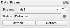
Fig. 3 Data Stream Widget
The content of the combo box is dynamically fill based on the current connection with the respective Broker. This connection can be achieved by input the correct URI of the Broker via the following dialog (displayed when arrows symbol is pressed):
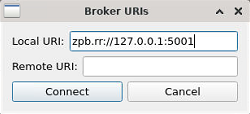
Fig. 4 Broker URIs Dialog
After Connection Button is pressed the validation of the connections starts and in the end a success or unsuccess message will be displayed. Is successful the datastreams list from the DDT Broker will be extract and added to the combo box fields.
The other buttons present in the Data Stream Widget are:
Attach - When pressing the Attach button, the related Image Widget will be connected to the specified data stream. Alternatively, the command line options
--localbroker_uri,--remotebroker_uriand/or--datastreamcan be used to directly connect to a specific Broker Data Stream.Detach - When pressing the Detach button or closing the application the stream is disconnected again. If the data stream cannot be found or the connection fails, the DDT Viewer will report this in the log output.
The current status of the connection will be shown by a small LED icon. Green indicates an established connection, gray a disconnected link. When data is being received the light will flicker between green and gray.
The Data Stream Widget can also be added to a viewer using the Qt Designer. Table 14: Properties of the Data Stream Widget
The Data Stream Widget can be connected to an Image Widget using the following signals and slots in the current version:
External Signal / Slot |
Description (if required) |
|---|---|
Signal: AttachDataStream( QString data_stream_id) |
Stream was attached. |
Signal: DetachDataStream( Qstring data_stream_id) |
Stream was detached. |
Signal: LastBrokerConnection( Qstring data_stream_id) |
Send last broker ID to ImageWidget |
Slot: AttachDataStream() |
Called when stream was attached. |
Slot: DetachDataStream() |
Called when a stream was detached. |
Slot: SetDataStream(QString stream) |
Called at startup to set the startup data stream. |
Slot: CurrentStatus(QString stream_id, ConnectionStatus status) |
Called when the connection status changes. |
Slot: FlickerStatus() |
Used to show activity on the status when data is received. |
Slot: PopulatePublisherListCombo (QString localbroker_uri, QString remotebroker_uri) |
After connection is stablish retrieve datastream list and add then to the combo box |
Slot: DisplayURIsDialog() |
Trigger by pressing arrows button to display Broker URIs dialog |
Flip / Rotate Widget
The Flip / Rotate Widget can be used to flip or rotate the image in the related Image Widget.
The widget offers three buttons – flip vertical, flip horizontal and rotate.

Fig. 5 Flip Rotate Widget
The Flip / Rotate Widget can be added using the Qt Designer. It has three properties for its configuration:
Property |
Default |
Description |
|---|---|---|
FlipHorizontal |
false |
Image shall be flipped horizontally at startup (currently not supported). |
FlipVertical |
false |
Image shall be flipped vertically at startup (currently not supported). |
RotateClockwise |
true |
Flag to determine whether rotate will be clockwise or anti-clockwise. |
The Flip Rotate Widget can be connected to a related Image Widget using the following signals and slots in the current version:
External Signal / Slot |
Description (if required) |
|---|---|
Signal: FlipImage(bool vertical_axis, bool horizontal_axis) |
Change flip state. |
Signal: RotateImage(int angle) |
Rotate Image. |
Slot: FlipVertical() |
Received to update the status of the flip buttons. |
Slot: FlipHorizontal() |
Received to update the status of the flip buttons. |
Slot: Rotate() |
Received when rotate button is pressed. |
Scale Buttons Widget
The Scale Buttons Widget can be used to zoom in and out of the image in the related image widget. In the current version the widget has no properties. The default scale and the possible scale factors are already defined in the Image Widget and will be handled there. The widget offers three buttons: Zoom in, Zoom out, Default scale.
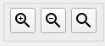
Fig. 6 Scale Buttons Widget
In the Zoom in and Zoom out button will change the current scale
used for the image. Both buttons increase rsp. decrease the current zoom
factor by 1 for values larger or equal to 1 and increase or decrease the
denominator of the scale for values less then 1. So the scale values are
changing like 1, 2, 3, 4, 5,... or 1, 1/2, 1/3, 1/4,... etc. Maximum scale
factor will be 20, minimum scale factor 1/20.
The same functionality can be triggered by using the mouse scroll wheel while the mouse pointer is inside the Image Widget.
The ‘Default scale’ button will set the scale to the default scale
configured in the related property of the Image Widget. Default here is
1/2.
The current version of the Scale Buttons Widget can be connected to the related Image Widget using the following signals and slots:
External Signal / Slot |
Description (if required) |
|---|---|
Signal: IncrementScale() |
Moves to the next scale value in the configured list. |
Signal: DecrementScale() |
Moves to the previous scale value in the configured list. |
Signal: SetToDefaultScale() |
Sets the scale value to the default scale which is configured in the properties of the Image Widget. |
Panning Widget
The Panning Widget allows to navigate the visible portion of the image in the related Image Widget. In the current version the widget has no properties.
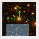
Fig. 7 Panning Widget
The widget can simply be operated using the mouse. By dragging the shown rectangle in the preview image, the visible part of the image in the Image Widget is adjusted accordingly.
The widget uses a Qt Property ShowAxes. When the flag is set to true,
a compass will be plotted into the pan preview window showing the north
and east direction in the image. Currently the flag will be
automatically set, when the image that was loaded contains the WCS
coordinate information which are needed to determine the north direction
for the image.
When the loaded image contains proper WCS coordinate information the pan widget will automatically draw a compass into the image. The rotation angle needs to be provided from the class sending the related signal. The compass can be switch on and off by using the right mouse button while clicking into the pan widget.
The Panning Widget can be connected to the related Image Widget using the following signals and slots in the current version:
External Signal / Slot |
Description (if required) |
|---|---|
Signal: UpdatePosition(int scroll_x, int scroll_y) |
Pan movement in widget. |
Slot: SetImage(QImage* image, QTransform& transform, bool show, double rotation) |
Image needs to be updated. Also contains formation, if the compass can be drawn and the required rotation angle. |
Slot: ImageWidgetViewChanged(QRect visible_image_rect, int current_width, int current_height) |
View in image widget changed. |
Image Scale Widget
The Image Scale Widget allows the user to directly select the current scale factor which shall be used for the Image Widget connected.
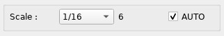
Fig. 8 Image Scale Widget
In the widget a combo box offers a selection of scale factors the user
can directly select so that they are applied to the image. The list of
possible scale factors can be configured as a property in the Image
Widget. One entry in the combo box is the entry FIT. When selecting
the FIT entry the current image will be automatically re-scaled so
that the full image becomes visible in the Image Widget.
Next to the combo box the current scale factor used for the Image Widget is being displayed.
A checkbox offers the option to switch on / off the auto scale mode.
When the auto scale mode is active, new images that are loaded from disk
or received from a data stream are automatically re-scaled so the full
image becomes visible (if possible) in the display. The auto scale
function will use a value of the configured list of scale factors. As
soon as the user changes the scale on purpose, e.g. by using the combo
box, the AUTO checkbox is unchecked automatically.
The Image Scale Widget can be connected to the related Image Widget using the following signals and slots in the current version:
External Signal / Slot |
Description (if required) |
|---|---|
Signal: IncrementScale() |
Signals the Image Widget to move one scale factor up in the list of scale factors. |
Signal: DecrementScale() |
Signals the Image Widget to move one scale factor down in the list of scale factors. |
Signal: SetToDefaultScale() |
Selects the default scale factor. |
Signal: SelectScale(QString scale) |
Change the scale factor to the selected value. |
Signal: SetAutoScale(bool new_auto_scale_state) |
Toggles the auto scale selection. |
Slot: UpdateScaleLabel(QString new_scale_factor) |
Updates the current scale factor display. |
Slot: NewScaleFactors(QList <QString> newScaleFactorList) |
Populates the list of scale factors in the combo box. |
Slot: NewAutoScaleState(bool) |
Slot which is called when the autoscale state is modified. |
Colourmap Widget
The Colourmap Widget will give a graphical representation of the currently selected colourmap. The colourmap can be selected using the Colourmap Dialog.
Depending on the current cut values which are used for the display of the image, a scale will be automatically fitted to the colour bar. The axis depends on the current scaling function that was selected in the Colourmap Dialog (linear, logarithmic or square root).
A default colourmap can be configured in the properties of the Image Widget.

Fig. 9 Colourmap Widget
The Colourmap Widget allows the user to change the contrast of the current selected colourmap. This can be achieved as follows:
Clicking and dragging with the left mouse button on the Colourmap Widget shifts the colourmap by the amount of pixels of the moved distance.
Clicking and dragging with the left mouse button on the Colourmap Widget while the ctrl key is pressed, rotates the colourmap by the amount of pixels of the moved distance.
Clicking and dragging with the right mouse button on the Colourmap Widget scales the colourmap by a factor. This factor is the amount of pixels of the moved distance. Dragging with the right mouse button to the right leads to a shrinking of the colourmap, while dragging to the left leads to a stretching.
Clicking with the mouse wheel on the Colourmap Widget restores the original colourmap.
The changed contrast is applied to the Colourmap Widget and to the image in the Image Widget as soon as the corresponding mouse button is released.
To provide visual feedback to the user that actions can be performed on
the Colourmap Widget, the cursor shape changes as follows: When entering
the Colourmap Widget with the mouse, the cursor shape changes to
Qt::OpenHandCursor. As soon as any of the mouse buttons is pressed, it
will change to Qt::ClosedHandCursor. The cursor changes back to its
previous shape when leaving the Colourmap Widget.
The Colourmap Widget can be connected to the related Image Widget using the following signals and slots in the current version:
External Signal / Slot |
Description (if required) |
|---|---|
Signal: ChangeContrast( ddt::colorMap_t colourmap, ddt::colorMap_t colourmap_inverted, ddt::colorMapARGB_t colourmap_argb, colorMapARGB_t colourmap_argb_inverted |
Signals the image widget that the contrast was changed by the user. Creates and passes customized colour maps. |
Signal: RestoreColourmap() |
Signals the image widget that the colourmap should be restored. This is triggered by pressing the mouse wheel on the colourbar. |
Slot: SetCurrentColourmap( QVector<QRgb> colourmap) |
Receives the current colour map from the Image Widget. |
Slot: UpdateColourbarAxis( double min_value, double max_value, int int scaling_function) |
Receives minimum and maximum values and the scaling function used to update the axis labels. |
Cursor Information Widget
The Cursor Information Widget displays information on the image point currently under the mouse pointer while the user moves the mouse pointer through the related Image Widget.
What information is displayed can be configured by the two properties
show_XY and show_RADEC of the widget. By setting these flags it is
possible to switch between the display using X, Y coordinates or WCS
coordinates or both. A third property (xyDigits) can be used to
configure the number of digits after the decimal point.
The cursor information contains the X and Y-coordinates of the original image (independent of rotation or flipping) and the original pixel value at that location.
Furthermore, when the image contains the related information to calculate the WCS coordinates the right ascension and declination for the image point is given.

Fig. 10 Cursor Information Widget
The Cursor Information Widget can be connected to the related Image Widget using the following signals and slots in the current version:
External Signal / Slot |
Description (if required) |
|---|---|
Slot: CursorInfo(double x, double y, double pixelvalue, QString ra, QString decl) |
Slot that is called when updated information is available. |
Cut Values Widget
The Cut Values Widget allows the user to specify the lower and upper limits used to display the image. The widget offers three options to specify the limit values:
Auto Cuts: The lower and upper limit is calculated using a median filter on the image
Min/Max: The lower and upper limit are the minimum and maximum pixel value
User Defined: The user can specify the limits manually
For the user defined case two default values are shown (here 0 and 255).
These default values can be set using two Qt Properties of the widget:
default_low and default_high.
When the user enters new min/max values, it is possible to just press
the RETURN key after inserting a new number or press the Min/Max button.
The values displayed in the right fields are the currently used values.

Fig. 11 Cut Values Widget
The Cut Values Widget can be connected to the related Image Widget using the following signals and slots in the current version:
External Signal / Slot |
Description (if required) |
|---|---|
Signal: SetCutValues(double low, double high) |
Signals the Image Widget that new cut values should be applied to the image. |
Signal: SetAutoCuts() |
Signals that the Image Widget should calculate the auto cut values and apply them. |
Signal: SetMinMax() |
Signals the Image Widget to calculate the minimum and maximum pixel value and apply them. |
Slot: CurrentCutValues(double min, double max, dd::ImageHandling:: CutLevelType type) |
Slot that can be used to update the current cut values and the method which is used for the calculation. |
Magnification Widget
The Magnification Widget shows an enlarged part of the image around the current mouse pointer position.
The widget can be configured using the following Qt Properties:
default_magnification_factors- Comma separated list of scale factors
center_rectangle_size- Size of the rectangle displayed in the center of the magnified image (default size 0 pixels)
The list of default magnification factors defaults to: 1, 2, 4, 6, 8,
10, 12, 16, 20
The widget allows the user to select the current magnification factor using the three buttons which will increase or decrease the magnification factor set the magnification factor to 1.

Fig. 12 Magnification Widget
The Magnification Widget can be connected to the related Image Widget using the following signals and slots in the current version:
External Signal/Slot |
Description (if required) |
|---|---|
Signal: SetMagnificationFactor( QString factor) |
Send when the magnification factor for the widget was changed. |
Slot: MagnifiedImage(QImage) |
Receives the magnified image. |
3D Cube Navigation Widget
The 3D Cube Navigation Widget can be used to navigate through the planes
of a 3D image or image extension. After opening such an image or image
extension (either by using the extension notation [<extension number>]
when specifying the filename in the Open File dialog (e.g.
SCI-GUM43_COMBINED_CUBE_010.fits[2]) or by selecting the extension in
the DDT HDU Dialog), the 3D Cube Navigation Widget looks similar to
this:

Fig. 13 3D Cube Widget
In this example, the numbers 1 / 2048 mean that plane number 1 from a
total of 2048 planes is currently displayed. With help of the arrow
buttons it is then possible to navigate through the planes. Use the
buttons in the following way:
- Skip to the first plane.
- Fast-rewind by 10 planes.
- Rewind by 1 plane.
- Forward by 1 plane.
- Fast-forward by 10 planes.
- Skip to the last plane.
Clicking the rewind and forward buttons will result in one skip operation. It is also possible to keep the mouse button pressed on these buttons, which will result in a continuous skipping of planes.
Note that the fast-skipping buttons will not skip if the resulting plane number would be out of the range.
DDT Dialogs
The DDT Dialogs library contains a number of dialogs which shall be accessible via a context menu of the Image Widget.
All dialogs can be created using a Dialog Factory class. Dialogs are created based on the Dialog ID. The same ID can be used to add dialogs to the context menu of the Image Widget.
The list of active dialogs is stored in the Qt Property
ListContextMenu of the Image Widget. The list contains the
comma-separated dialog IDs. All entries of the list will be selected for
the context menu of the Image Widget. When the property is left empty by
default all menu items will be displayed.
The dialogs will then be displayed in the context menu of the Image Widget:

Fig. 14 Context menu of the Image Widget
The list of available dialog ID is as follows:
Dialog ID |
DDT Dialog |
|---|---|
ddtColourmap |
Selection of colourmap and scaling dialog |
ddtPickObject |
Pick object dialog |
ddtBias |
Bias image dialog |
ddtTabularRegion |
Tabular region dialog |
ddtStatistics |
Statistics dialog |
ddtHDU |
HDU display dialog |
ddtFITSHeader |
FITS header dialog |
ddtFITSTable |
Binary Table dialog |
ddtReferenceLine |
Reference line dialog |
ddtDistance |
Distance measurement dialog |
ddtPVCM |
PVCM dialog |
ddtGraphicalElements |
Dialog for graphical elements |
ddtGraphicsControl |
Dialog for control of graphical elements |
ddtSlit |
Slit dialog |
ddtCutValues |
Cut value dialog |
ddtDataStream |
Data Stream dialog |
ddtScaleRotateCut |
Dialog for cut value, scale factor and flip/rotate |
ddtMagnification |
Magnification dialog |
ddtMetadataSample |
Metadata from attached datastream |
ddtMonitorSample |
DDT Broker connection statistics |
All dialogs are created using a Factory class DdtDialogFactory. The main method of the factory class is the method to create a dialog:
static DdtDialog* createDialog(QString dialog_id);
All DDT Dialog are then subclassed from the common base class
DdtDialog.
This class has the pure virtual method:
virtual void CreateDialog() = 0;
which is used to setup the dialog GUI elements.
Since all dialogs should be able to support the basic buttons Confirm,
Cancel and Quit a method
virtual void AddDefaultButtonsToLayout(QBoxLayout* layout, bool
show_confirm_button, bool show_quit_button, bool show_cancel_button);
Here three flags can be used to either add or not add the required default buttons.
The buttons have the function:
Quit - Quits the dialog and returns an empty string
Cancel - Cancels the current operation
Confirm - The dialog is closed and the collected data of the dialog is returned
Furthermore, the dialogs have a virtual method:
virtual void SetInitialParameter(QString parameter_id, QVariant
parameter) = 0;
This can be called to setup initial values in the dialog, when it is created. Each parameter will use a parameter ID to be identified. Initial values can be e.g. scale factors, images, image points etc.
The base dialog class also has a set of signals and slots:
External Signal/Slot |
Description (if required) |
|---|---|
Signal: ParameterChanged(QString dialog_id, QString parameter_id, QVariant parameter) |
The signal is sent when a parameter of the dialog is changed that is required by the image handling backend. Parameters are again identified using a parameter ID. |
Slot: SetChangedParameter(QString param_id, QVariant parameter) |
The slot is called when the backend functions change some parameters used by the dialog. This could be e.g. the results of a calculation which was triggered by the dialog. |
In the following sub sections the existing dialogs are described.
Pick Object Dialog
The Pick Object dialog can be used to calculate some statistical data for objects or points in the image. Therefore, the dialog offers two modes. One is the Object mode and one is the Cursor mode.
In the dialog these two modes can be selected using one of two radio
buttons Object or Cursor. The dialog starts in an active Object
mode and the user is able to immediately pick an object. If a pick mode
is activated the cursor shape changes to a cross when hovering the mouse
over the image widget. This indicates that a user is able to perform a
pick operation. Then when clicking on any pixel in the image inside the
Image Widget the following is shown.

Fig. 15 Pick Object Dialog
Mode |
Clicked on |
Result |
|---|---|---|
Cursor Mode |
Any pixel in the main image |
The dialog will display the X and Y coordinate of the pixel (from the original image) plus the pixel value at that location. When the image in the display contains the necessary meta-data also the WCS coordinates (RA and DEC) will be displayed. All other values are set to 0. |
Object Mode |
Click on any pixel belonging to a star (or circular object) |
The centre of the object is automatically located and the X, Y coordinates displayed in the dialog give the X, Y coordinate of the object’s centre (not the coordinate the user clicked at). All other values like the Equinox, the FWHM in x and y direction, the angle of X axis, the peak above background and the background are calculated and displayed. |
Click outside a star |
When picking an object fails, the
Pick Object Dialog stays in the
active object mode and the user can
repeat the pick operation until it
was successfully performed or
cancelled by clicking on |
The buttons that the dialog offers have the following functions:
Button |
Function |
|---|---|
Pick |
Activates the Pick mode. The user can now click a pixel in the Image Widget. Depending on the selected pick mode the related information is being displayed whenever the user clicks in the image. The Pick mode is then deactivated again. |
Cancel Pick |
Only enabled, while the Pick mode is active. It cancels the pick mode. The displayed values are cleared. |
Confirm |
Closes the dialog and returns the last results calculated as a string in the format:
|
Quit |
Closes the dialog and returns an empty string. |
The slider control in the Pick Object Dialog allows to select the size of the rectangle (or rather square) for which the calculation is done. The minimum value is fix at 10. The upper value will be dynamically set depending on the current magnification factor. In the magnification widget a rectangle will be drawn around the center with the dimensions according to the selected number of pixels.
The Show Marker checkbox can be checked to display a cross on the
selected object in the magnification view. The cross will be using the
rotation angle and the FWHM values for x and y axis for its dimensions.
It will mark the centre of the selected object. The same marker is also
drawn into the image of the image widget.
The current version does not yet implement the entry of samples (currently only 1 sample is used independent of the selection made).
The Pick Object Dialog uses the signal:
ParameterChanged(QString dialog_id, QString param_id, QVariant
parameter);
to communicate with the Image Widget. The following parameter IDs are supported:
Parameter ID |
Meaning |
|---|---|
DDT_DIALOG_PARAM_PICK_MODE** |
Informs the Image Widget of the selected pick mode (Object or Cursor, active or inactive). |
DDT_DIALOG_PARAM_PICK_RECTANGLESIZE** |
Signal a change of the number of pixels in x-y-direction used for the calculation (No. pixels) |
DDT_DIALOG_PARAM_PICK_RETURN_VALUES** |
Used to return the calculated values as described in Table 28 |
DDT_DIALOG_PARAM_PICK_CANCELLED** |
Informs the Image Widget that the pick operation was cancelled. |
DDT_DIALOG_PARAM_PICK_ACTIVATED** |
Informs the Image Widget that the pick operation was activated. |
DDT_DIALOG_PARAM_PICK_MAGNIFIED_IMAGE** |
Used to receive the magnified image for the thumbnail view of the magnification widget. |
DDT_DIALOG_PARAM_PICK_MAGNIFY_FACTOR** |
Used to send the current magnification factor of the magnification widget. |
Colourmap Dialog
The Colourmap dialog can be used to select the false colouration map that should be used for the image colouring and the scaling function to use.
Colourmaps are read from the directory $DDT_COLORMAP_PATH. Colourmaps
are files in ASCII format containing 256 lines of R-G-B values given in
the range of 0.0 to 1.0.

Fig. 16 Colourmap Dialog
Colourmap files must use the extension .lut and the typical structure
of the file is like this:
0.95686 0.58431 0.85490 0.95686 0.58824 0.85490 0.96078 0.59216 0.85490
0.96078 0.59608 0.85882 0.96078 0.60000 0.85882 ...
(256 lines in total)
The colourmap will be applied to images in that way that the first R-G-B
value is assigned to the minimum cut value and the last R-G-B value to
the maximum cut value.
The 256 values are then being assigned according to the selected scaling function either as a linear scale, a logarithmic or a square root scale.
Colourmaps and scaling functions are automatically applied when the user
selects them. If checked the Invert Colourmap checkbox will invert the
chosen colourmap. A quit button can be used to close the dialog.
The Colourmap Dialog uses the signal:
ParameterChanged(QString dialog_id, QString param_id, QVariant
parameter);
to communicate with the Image Widget.
The following parameter IDs are supported:
Parameter ID |
Meaning |
|---|---|
DDT_DIALOG_PARAM_IMAGE_PATH |
Informs the Image Widget of the path to the image file to be displayed. |
DDT_DIALOG_PARAM_IMAGE_ROTATION |
Informs the Image Widget of the rotation angle of the image. |
DDT_DIALOG_PARAM_IMAGE_SCALE |
Informs the Image Widget of the scaling factor to be applied to the image. |
DDT_DIALOG_PARAM_IMAGE_DISPLAY_AREA |
Informs the Image Widget of the display area of the image. |
FITS Header Dialog
The FITS Header Dialog can display the FITS Header of the main HDU when a FITS file is loaded in the Image Widget.
The dialog reports the filename of the currently loaded file, have a
Cancel button to close it and have a search bar that allows the user to
go thought the matched string on the line edit. The correspondent matches are
marked with yellow in the text area.

Fig. 17 FITS Header Dialog
The FITS Header Dialog uses the signal:
ParameterChanged(QString dialog_id, QString param_id, QVariant
parameter);
to communicate with the Image Widget.
The following parameter IDs are supported:
Parameter ID |
Meaning |
|---|---|
DDT_DIALOG_PARAM_FITS_HEADER_DATA |
Using this parameter the FITS Header data can be send to the dialog. |
DDT_DIALOG_PARAM_FITS_HEADER_FILE |
Using this parameter the name of the FITS file can be send to the dialog. |
DDT_DIALOG_PARAM_FITS_HEADER_RESET |
Using this parameter the widgets content inside the FITS dialog can reseted. |
Data Stream Dialog
The Data Stream Dialog contains the same functionality that is included in the Data Stream widget, see section 3.3.2.1.2. It is a dialog version of the widget that can be used in Viewer applications that do not contain the widget.
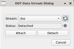
Fig. 18 Data Stream Dialog
The Data Stream Dialog uses the signal:
ParameterChanged(QString dialog_id, QString param_id, QVariant
parameter);
to communicate with the Image Widget. The following parameter IDs are supported:
Parameter ID |
Meaning |
|---|---|
DDT_DIALOG_PARAM_ATTACH_DATA_STREAM |
Informs the Image Widget that a data stream should be attached. |
DDT_DIALOG_PARAM_DETACH_DATA_STREAM |
Informs the Image Widget that a data stream should be detacted. |
DDT_DIALOG_PARAM_STATUS_DATA_STREAM |
Reports the status of the currently selected data stream. |
DDT_DIALOG_PARAM_NAME_DATA_STREAM |
Sets the name for the data stream. |
Image Header Data Units (HDU) Dialog
The Image HDU Dialog can be used to access additional HDUs of FITS files
loaded in the Viewer. Once a FITS file containing several HDUs was
opened, this dialog appears automatically and offers a list of all HDUs
showing the type, the name and information on the dimension of the HDU.
After selecting an entry in the list the Open button can be used to
load the content into the viewer. HDUs of type image will be displayed
in the Image Widget. Binary Tables will be displayed in a separate
dialog (the Binary Table Dialog described in 3.3.2.2.6).
The additional button Display as one image allows the user to open all
HDUs of type image into a single view in the Image Widget.

Fig. 19 HDU Dialog
The HDU Dialog uses the signal:
ParameterChanged(QString dialog_id, QString param_id, QVariant
parameter);
to communicate with the Image Widget. The following parameter IDs are supported:
Parameter ID |
Meaning |
|---|---|
DDT_DIALOG_PARAM_HDU_FILE |
Name of the FITS file containing several HDUs. |
DDT_DIALOG_PARAM_HDU_TABLE_SIZE |
Size of the selected table. |
DDT_DIALOG_PARAM_HDU_TABLE_DATA |
Data of the selected table. |
DDT_DIALOG_PARAM_HDU_SINGLE_IMAGE |
Send to open a single image selected from the table. |
DDT_DIALOG_PARAM_HDU_ALL_AS_ONE |
Send to open all images in a single view. |
Binary Table Dialog
The Binary Table Dialog is used to display the content of binary table extensions of FITS files. If the primary HDU of a fits file cannot be loaded, the DDT Viewer automatically loads the next valid extension. If this extension contains a binary table, the Binary Table Dialog appears automatically.
Once a binary table was selected and opened in the HDU dialog (see 3.3.2.2.5) the content is displayed in this dialog. The format of the table depends on the content of the binary table.
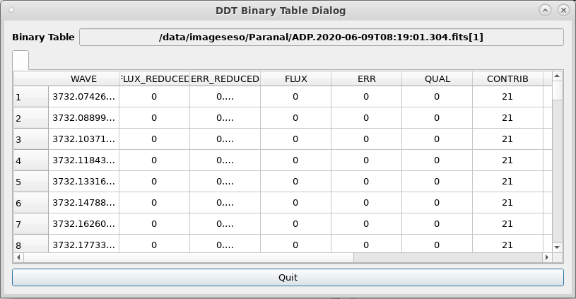
Fig. 20 Binary Table Dialog
The Binary Table Dialog uses the signal:
ParameterChanged(QString dialog_id, QString param_id, QVariant
parameter);
to communicate with the Image Widget. The following parameter IDs are supported:
Parameter ID |
Meaning |
|---|---|
DDT_DIALOG_PARAM_FITS_TABLE_DATA |
Data from the selected binary table. |
DDT_DIALOG_PARAM_FITS_TABLE_SIZE |
Size (columns, rows) of the binary table. |
DDT_DIALOG_PARAM_FITS_TABLE_COL_NAMES |
Names of the table columns. |
DDT_DIALOG_PARAM_FITS_TABLE_CLEAR |
Clear the table dialog. |
DDT_DIALOG_PARAM_FITS_TABLE_CLEAR_AND_PREPARE |
Clear the table dialog and prepare display of next table (fill table name field and prepare necessary tabs). |
Tabular Region Dialog
The Tabular Region Dialog can be used to display pixelvalues around the current mouse pointer position.
The dialog will show a table of nx x ny values around the mouse
position. The size of the table can be configured by setting the values
for nx and ny and pressing the Resize Table button.
In addition, the dialog will calculate some statistics on the selected data. These statistic values are:
The minimum pixelvalue (min)
The maximum pixelvalue (max)
The average of the pixelvalues (ave)
The root-mean-square value of the pixelvalues (rms)

Fig. 21 Tabular Region Dialog
The Tabular Region Dialog uses the signal:
ParameterChanged(QString dialog_id, QString param_id, QVariant
parameter);
to communicate with the Image Widget. The following parameter IDs are supported:
Parameter ID |
Meaning |
|---|---|
DDT_DIALOG_PARAM_TABULAR_REGION_DATA |
This is used to get the pixel value data. |
DDT_DIALOG_PARAM_TABULAR_REGION_ROWCOLDATA |
This is used to resize the table to a new size. |
DDT_DIALOG_PARAM_TABULAR_REGION_STATISTICDATA |
Contains the statistics data. |
DDT_DIALOG_PARAM_TABULAR_REGION_RESIZE |
This signal is sent when the table size was changed. |
Graphical Elements Dialog
The Graphical Elements Dialog can be used to draw overlay elements like ovals, crosses, rectangles, lines or text into the Image Widget.
The dialog offers buttons to select drawing any of those elements. While one of these buttons is selected, the user can draw this kind of overlay elements into the image.
The button showing an arrow can be used to activate the selecting mode.
This enables the user to resize, move and select any of the previously
drawn elements. When the button is pressed the mouse cursor changes to a
pointing hand when hovering over the image widget. If the mouse is then
hovered over one of the graphical elements, green corners appear on that
element. These corners are part of a so-called selection rectangle.
When the mouse is hovered over one of these corners, that corner changes
its colour to red in order to indicate to the user that this corner can
now be used to resize the element. To do so, a corner must be clicked
and dragged with the left mouse button. In order to move an element the
user can simply click on it and drag it to another position in the
image. By clicking on an element (without moving the mouse) an element
can be selected which is indicated by the selection rectangle that
appears in the background. This selection rectangle encloses a
graphical element and contains a green pattern. If an element is
selected the Delete button can be used to delete that element.
Clicking a second time on an element it gets unselected and the green
pattern disappears. If an element is selected and the user clicks the
button with the arrow in order to leave the selection mode, the
element automatically gets unselected.

Fig. 22 Selected element with green background pattern and hovered element with green corners.
The dialog also allows to define certain properties of the overlay elements. These are:
Line thickness in pixel
Font used for text
Line colour
Line Style (Solid, Dashed, Dotted, Dash-dotted)
Checkbox to select a fill colour plus the colour used for filling objects
A tag (a string) that can be used to assign certain tags to overlay elements
Threshold scale (a value which defines at which scale factor overlay elements will be hidden)
Rotation angle
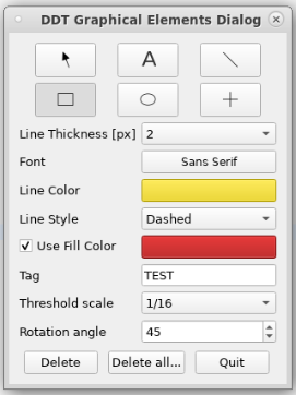
Fig. 23 Graphical Elements Dialog
The tag can be used, e.g. by the Overlay API described in 3.3.2.3 in order to hide or show all elements using a given tag.
Setting a rotation angle enables drawing rotated graphical elements. If
a rotated graphical element is selected, the selection rectangle
encloses the whole rotated element and a green pattern appears within
the selection rectangle.
In the case of a rotated rectangle the corners of the selection
rectangle are not located on the corners of the rotated rectangle. The
resizing of rotated rectangles is limited in such that these rectangles
cannot get flipped. This means that it is not possible to drag a
selection corner across other corners. This limitation explicitly
applies only for rectangles which are rotated. There is no such
limitation for all other graphical elements regardless of their rotation
and there is also no limitation for not-rotated rectangles.
The dialog also offers a number of buttons. These can be used to delete
a selected overlay element (Delete), to delete all elements of a
specific type (Delete all..) or to close the dialog (Quit).
The Graphical Elements Dialog uses the signal:
ParameterChanged(QString dialog_id, QString param_id, QVariant
parameter);
to communicate with the Image Widget. The following parameter IDs are supported:
Parameter ID |
Meaning |
|---|---|
DDT_DIALOG_PARAM_LINE_THICKNESS |
Sets the line thickness for overlay elements. |
DDT_DIALOG_PARAM_FONT |
Sets the font used for text overlays. |
DT_DIALOG_PARAM_FILL_COLOR |
Sets the fill colour for overlay elements. |
DDT_DIALOG_PARAM_FILL_ENABLED |
Sets a flag, if the fill colour should be used. |
DT_DIALOG_PARAM_LINE_COLOR |
Sets the line colour for the overlay elements. |
DDT_DIALOG_PARAM_TAG |
Sets the tag for overlay elements. |
DDT_DIALOG_PARAM_DRAW_MODE |
Sets the current draw mode (e.g. rectangle, ellipse, line, etc.) |
DDT_DIALOG_PARAM_DELETE_ELEMENT |
Sends a signal that the selected element should be deleted. |
DDT_DIALOG_PARAM_SCALE_THRESHOLD |
Sets the threshold scale value. Overlay elements will be hidden below this threshold. |
DDT_DIALOG_PARAM_SCALE_THRESHOLD_LIST |
Gives the list of possible scale factors to the dialog. |
DDT_DIALOG_PARAM_LINE_STYLE |
Sets the line style for the overlay elements. |
DDT_DIALOG_PARAM_ROTATION_ANGLE |
Sets the rotation angle for the overlay elements. |
Graphics Control Dialog
The Graphics Control Dialog can be used to select which Graphical Elements (see previous chapter) should currently be visible in the display.
The dialog offers various options to control the display of Graphical Elements.
First of all the checkbox Enable graphical elements can be used to
enable or disable the display of all Graphical Elements. When this
checkbox is unchecked, all elements will be hidden in the display. When
it is active the elements will be displayed based on the further
selections done in this dialog.
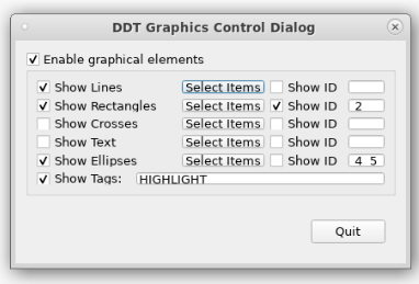
Fig. 24 Graphics Control Dialog
The remaining elements will either be grouped by the type of Graphical Elements (like Lines, Rectangles, etc.) or related to the tags used for the Graphical Elements.
The first category consists of the following elements – shown for the example of Rectangles:

Fig. 25 Graphics Flag
For each type of Graphical Element these options can be selected:
Show <Item Type> - Show or hide all elements of a given type
Select Items - A button which shows a list of all element IDs of this type
Show ID - Allows to show / hide only the elements with the selected ID
When pressing the Select Items button a list of all currently
displayed elements will be shown. The user can select any number of IDs
from that list to place them into the edit box on the right. When
selecting the Show ID checkbox either only the elements from the list
of IDs are shown or only those of the ID are hidden.
Finally the option Show Tags allows to show or hide elements with a
given tag. Tags can be specified as property of the Graphical Elements
when drawing them. The edit box next to the checkbox allows the entry of
tags (separated by white space).
The Graphics Control Dialog uses the signal:
ParameterChanged(QString dialog_id, QString param_id, QVariant
parameter);
to communicate with the Image Widget. The following parameter IDs are supported:
Parameter ID |
Meaning |
|---|---|
DDT_DIALOG_PARAM_ENABLE_ALL_ELEMENTS |
Select if all elements should be hidden or shown (when matching the other selections). |
DDT_DIALOG_PARAM_SHOW_LINES |
Show or hide line elements. |
DDT_DIALOG_PARAM_SHOW_RECTANGLE |
Show or hide rectangle elements. |
DDT_DIALOG_PARAM_SHOW_CROSSES |
Show or hide crosses. |
DDT_DIALOG_PARAM_SHOW_TEXT |
Show or hide text. |
DDT_DIALOG_PARAM_SHOW_ELLIPSES |
Show or hide ellipses. |
DDT_DIALOG_PARAM_SHOW_TAG |
Show or hide elements by tag. |
Cut Values Dialog
The Cut Values Dialog offers the same function as the Cut Values widget described in 3.3.2.1.9.

Fig. 26 Cut Values Dialog
The Cut Values Dialog uses the signal:
ParameterChanged(QString dialog_id, QString param_id, QVariant
parameter);
to communicate with the Image Widget. The following parameter IDs are supported:
Parameter ID |
Meaning |
|---|---|
DDT_DIALOG_PARAM_CURRENT_CUT_VALUES |
Sets the selected cut values. |
DDT_DIALOG_PARAM_CURRENT_CUT_TYPE |
Set the selected method for the cut values (auto, min/max, user defined) |
Bias Dialog
The Bias Dialog can be used to define a number of Bias images which can be applied to the image loaded in the Image Widget.
Bias images will be subtracted from the image loaded in the related Image Widget.

Fig. 27 Bias Dialog
The dialog holds 5 slots for bias images. Bias images can either be
captured from a attached data stream or can be loaded from the disk. The
current bias image can be selected using the radio buttons on the table
of bias images. By pressing the Apply Bias button the currently
selected bias image is applied. The Clear All button allows to clear
the list of bias images.
The buttons on top of the bias image list have the functions:
Select currently loaded image as bias image (for the selected table entry)
Load a FITS file as bias image to the selected slot
Display the FITS image in the Image Widget
Clear the selected table entry
By setting the On checkbox the bias function can be applied
automatically to all new images loaded.
The Bias Dialog uses the signal:
ParameterChanged(QString dialog_id, QString param_id, QVariant
parameter);
to communicate with the Image Widget. The following parameter IDs are supported:
Parameter ID | Meaning |
||
|---|---|---|
|
||
DDT_DIALOG_PARAM_BIAS_STORE_RETURN_VALUES |
Update list of bias images. |
|
DDT_DIALOG_PARAM_BIAS_APPLY_BIAS |
Send when a bias image should be applied. |
|
DDT_DIALOG_PARAM_BIAS_CLEAR_ALL |
Send when all bias images should be cleared. |
|
DDT_DIALOG_PARAM_BIAS_CLEAR_SELECTED |
Send when only a selected entry shall be cleared. |
|
DDT_DIALOG_PARAM_BIAS_LOAD_FROM_DISC |
Send when a bias image shall be loaded from disk. |
|
DDT_DIALOG_PARAM_BIAS_ENABLE_BIAS |
Send when the bias function shall be enabled. |
|
DDT_DIALOG_PARAM_BIAS_DISPLAY_SELECTED |
Send when the selected bias image should be displayed. |
|
DDT_DIALOG_PARAM_BIAS_CURRENT_SLOT_NAMES |
Sends the current slot names. |
|
DDT_DIALOG_PARAM_BIAS_CURRENT_SELECTED_SLOT |
Sends the selected slot. |
|
Statistics Dialog
The Statistics Dialog allows the user to define a rectangular region in the image for which statistics should be calculated.
The dialog will display the following values after the user selected a rectangle:
STARTX / STARTY / ENDX / ENDY - Corner coordinates of the rectangle
MEAN - Mean value of the pixels in the rectangle
RMS - Root-mean-square for the pixels
MIN / MAX: - Minimum and maximum pixel value
PIXELS - Number of pixels in the rectangle
MEDIAN - Median value of the pixels in the rectangle

Fig. 28 Statistics Dialog
The button Default can be used to set a default rectangle which is
centred on the image.
The Apply Cuts button will use the min/max values from the statistics
as new cut values for the image display.
When pressing Ok the dialog will return the statistics values as a
list:
<min> <max> <mean> <rms> <pixels> <median> <startx> <starty> <endx> <endy>
The Statistics Dialog uses the signal:
ParameterChanged(QString dialog_id, QString param_id, QVariant
parameter);
to communicate with the Image Widget. The following parameter IDs are supported:
Parameter ID | Meaning |
||
|---|---|---|
|
||
DDT_DIALOG_PARAM_STATISTIC_VALUES |
Update of the statistics values. |
|
DDT_DIALOG_PARAM_STATISTIC_COORDS |
Update of the coordinate values. |
|
DDT_DIALOG_PARAM_STATISTIC_CUT_VALUES |
Cut value function selected. |
|
DDT_DIALOG_PARAM_STATISTIC_RETURN_VALUES |
Return the current statistics as a string. |
|
DDT_DIALOG_PARAM_STATISTIC_DEFAULT_RECT |
Set the selection rectangle to the image center. |
|
DDT_DIALOG_PARAM_STATISTIC_INITIAL_VALUES |
Sets the initial values. |
|
Slit Dialog
The Slit Dialog can be used to calculate the offset of a position in the image to a defined slit object.
The user needs to select a point in the image and then the offset from this point to the slit object is calculated and displayed. The dialog will report the following values:
Target X / Target Y - Position the user selected via mouse click
Slit X / Slit Y - Centre position of the slit object
X Offset / Y Offset - Offset from the target location to the slit location
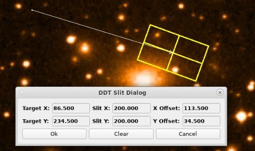
Fig. 29 Slit Dialog
The slit object is defined by a configuration file. The file is called:
slitparameter.ini
It is deployed to the resource/config-folder of the deployment
directory.
The file has the following syntax:
[slitparameter]
slit_x=200.0
slit_y=200.0
slit_size_x=50.0
slit_size_y=30.0
slit_angle=20.0
slit_color=yellow
When pressing the Ok button the dialog will return the values for the
offset calculation in the form:
Slit - <Offset X> <Offset Y> <Target X> <Target Y> <Slit X> <Slit Y>
The Slit Dialog uses the signal:
ParameterChanged(QString dialog_id, QString param_id, QVariant
parameter);
to communicate with the Image Widget. The following parameter IDs are supported:
Parameter ID |
Meaning |
|---|---|
DDT_DIALOG_PARAM_SLIT_DRAW_MODE |
Sets the draw mode for drawing of the slit object |
DDT_DIALOG_PARAM_SLIT_VALUES |
Specifies the slit values. |
DDT_DIALOG_PARAM_SLIT_RETURN_VALUES |
Will contain the return values as a string. |
DDT_DIALOG_PARAM_SLIT_INITIAL_VALUES |
Sets the initial values. |
DDT_DIALOG_PARAM_SLIT_DRAW_LINE |
Send when the line was drawn. |
Pixel vs. Colourmap (PVCM) Dialog
The PVCM Dialog will show the distribution of pixelvalues versus the colourmap values.
The dialog will display the data as a diagram and allow the user some options to modify the range for the calculations.
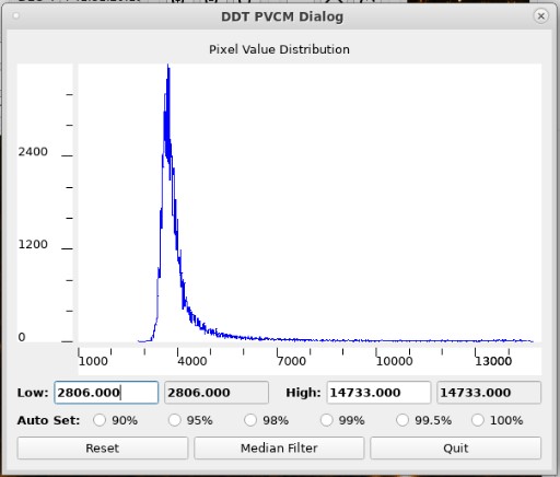
Fig. 30 PVCM Dialog
The dialog will show the minimum and maximum values (Low / High) used
for the diagram. The values are initially automatically calculated, but
the user can manually specify new low and high values, selecting them
via the RETURN key.
It is also possible to select the range for the histogram display using
the radio buttons 90%, 95%, 98%, 99%, 99.5% and 100%. These specify the
range that is taken into account for the display of the histogram.
In addition the button Reset will reset the display to its initial
values and the button Median Filter to the pixel distribution.
The PVCM Dialog uses the signal:
ParameterChanged(QString dialog_id, QString param_id, QVariant
parameter);
to communicate with the Image Widget. The following parameter IDs are supported:
Parameter ID |
Meaning |
|---|---|
DDT_DIALOG_PARAM_PVCM_CUT_VALUES |
Send when selecting the median filter option. |
DDT_DIALOG_PARAM_PVCM_HISTOGRAM_VALUES |
Contains the histogram values to be displayed. |
DDT_DIALOG_PARAM_PVCM_RESET |
Send when pressing the reset button. |
DDT_DIALOG_PARAM_PVCM_MEDIAN |
Send when pressing the median filter button. |
DDT_DIALOG_PARAM_PVCM_AUTO_SET |
Send when selecting one of the radio buttons. |
Reference Line Dialog
The Reference Line Dialog can be used to display the pixel distribution along a line defined by the user.
When opening the dialog, the use can define a line in the Image Widget
using the mouse. For the pixelvalues along the line then a diagram is
shown. The diagram can be displayed using different smoothing
algorithms: Step, Linear, Natural and Quadratic.
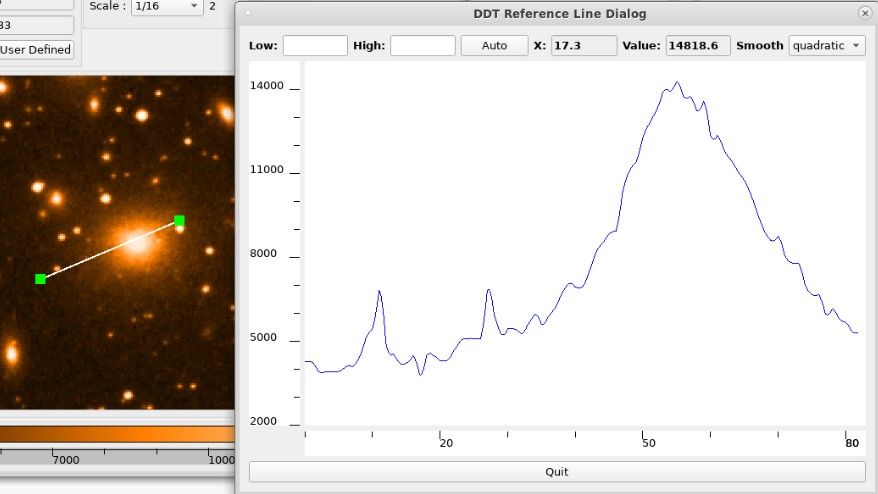
Fig. 31 Reference Line Dialog
The user can also select the minimum and maximum of the values on the
y-axis by manually entering values for the low/high values (and then
pressing RETURN). By pressing the Auto button, the minimum and maximum
are set automatically.
The user can also move the mouse pointer through the diagram to read the x and y-coordinates at a given point.
The Reference Line Dialog uses the signal:
ParameterChanged(QString dialog_id, QString param_id, QVariant
parameter);
to communicate with the Image Widget. The following parameter IDs are supported:
Parameter ID |
Meaning |
|---|---|
DDT_DIALOG_PARAM_REFLINE_RANGE_VALUES |
Sets the min and max values. |
DDT_DIALOG_PARAM_REFLINE_SPECTRUM_VALUES |
Retrieves the pixel values for the diagram. |
DDT_DIALOG_PARAM_REF_LINE_DRAW_MODE |
Sets the draw mode in the Image Widget to Reference Line mode. |
Flip Rotate Scale Cut Values Dialog
This dialog is a container for the Flip / Rotate widget (see 3.3.2.1.3), the Cut Values widget (see 3.3.2.1.9), the Scale Buttons widget (see 3.3.2.1.4) and the Image Scale widget (see 3.3.2.1.6).

Fig. 32 Flip Rotate Scale Cut Values Dialog
The Flip Rotate Scale Cut Values Dialog uses the signal:
ParameterChanged(QString dialog_id, QString param_id, QVariant
parameter);
to communicate with the Image Widget. The following parameter IDs are supported:
Parameter ID |
Meaning |
|---|---|
DDT_DIALOG_PARAM_ROTATE_BY_ANGLE |
Send when the image should be rotated. |
DDT_DIALOG_PARAM_FLIP_VERTICAL |
Send when the image should be flipped vertically. |
DDT_DIALOG_PARAM_FLIP_HORIZONTAL |
Send when the image should be flipped horizontally. |
DDT_DIALOG_PARAM_INCREMENT_SCALE |
Send when the image should be zoomed in. |
DDT_DIALOG_PARAM_DECREMENT_SCALE |
Send when the image should be zoomed out. |
DDT_DIALOG_PARAM_DEFAULT_SCALE |
Send when the image should be set to the default scale. |
DDT_DIALOG_PARAM_NEW_SCALE |
Send when the scale was changed. |
DDT_DIALOG_PARAM_AUTO_SCALE |
Send when auto-scale was selected. |
DDT_DIALOG_PARAM_SCALE_LIST |
Used to setup the list of possible scale factors. |
Distance Dialog
The Distance Dialog can be used to measure the distance between two locations in the current image. The distance will be measured in pixels.
When the dialog was selected, the user can draw a line into the connected Image Widget using the mouse pointer. The dialog will then display the start x/y coordinates, the end x/y coordinates and the offset in x- and y-direction.
When pressing Confirm the dialog closes and returns the the following
values as a string:
Offset X Offset Y Start X Start Y
When pressing Quit the dialog closes and returns nothing.

Fig. 33 Distance Dialog
The Distance Dialog uses the signal:
ParameterChanged(QString dialog_id, QString param_id, QVariant
parameter);
to communicate with the Image Widget. The following parameter IDs are supported:
Parameter ID |
Meaning |
|---|---|
DDT_DIALOG_PARAM_DISTANCE_DRAW_MODE |
Set the draw mode in the Image Widget to be able to draw a distance line. |
DDT_DIALOG_PARAM_DISTANCE_VALUES |
Is used to update the displayed distance values in the dialog. |
DDT_DIALOG_PARAM_DISTANCE_RETURN_VALUES |
Is used to return the measured distance values as Offset X, Offset Y, Start X, Start Y. |
DDT_DIALOG_PARAM_DISTANCE_INITIAL_VALUES |
Is used to set the initial distance values. |
DDT_DIALOG_PARAM_DISTANCE_CLOSED |
Is send when closing the dialog, so the draw mode and be reset in the Image Widget. |
Magnification Dialog
The Magnification Dialog will display a magnified part of the image surrounding the current mouse pointer location. The dialog contains the Magnification Widget described in section 3.3.2.1.10. The functionality of the dialog is the same as for the widget.

Fig. 34 DDT Magnification Dialog
The Magnification Dialog uses the signal:
ParameterChanged(QString dialog_id, QString param_id, QVariant
    parameter);
to communicate with the Image Widget. The following parameter IDs are supported:
Parameter ID |
Meaning |
|---|---|
DDT_DIALOG_PARAM_DLG_MAGNIFIED_IMAGE |
Used to send the magnified image of the current mouse surrounding to the dialog. |
DDT_DIALOG_PARAM_DLG_MAGNIFY_FACTOR |
Used to inform the Image Widget about the currently selected magnification factor. |
DDT_DIALOG_PARAM_DLG_CLEAR_MAGNIFIED_IMAGE |
Used to send the order to clean up the magnified image present in the dialog |
Metadata Samples Dialog
The Metadata Samples Dialog will display the detailed information about each samples incoming thought the DDT Broker. All paramenters will be presented in a list widget and is always the most recent sample information. This dialog is not based on a widget so is specifically used as a dialog.
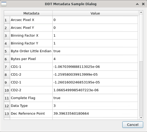
Fig. 35 DDT Metadata Samples Dialog
The Metadata Samples Dialog uses the signal:
ParameterChanged(QString dialog_id, QString param_id, QVariant
    parameter);
to communicate with the Image Widget and vice-versa. The following parameter IDs are supported:
Parameter ID |
Meaning |
|---|---|
DDT_DIALOG_PARAM_METADATA_CLEAR |
Used to send the order to the metadata dialog to clean up all information in the list |
DDT_DIALOG_PARAM_SNAPSHOT_IMAGE_METADATA |
Used to send the samples metadata parameters to be added in the dialog list |
Monitor Samples Dialog
The Monitor Samples Dialog presents how the DDT Broker is performing by extracting the and calculating specific characteristics from it. This calculation are determine based on each sample arrival and also based on the total time the DDT Viewer is attached to a datastream. Like the DDT Metadata Samples Dialog is not based on a Widget.

Fig. 36 DDT Monitor Samples Dialog
The Monitor Samples Dialog uses the signal:
ParameterChanged(QString dialog_id, QString param_id, QVariant
    parameter);
to communicate with the Image Widget and vice-versa. The following parameter IDs are supported:
Parameter ID |
Meaning |
|---|---|
DDT_DIALOG_PARAM_MONITOR_SAMPLE |
Used to send a statistic sample to the monitor dialogs and trigger calcualtion procedures |
DDT_DIALOG_PARAM_MONITOR_CLEAR |
Used to send the order to clean up the fields that display DDT Broker characteristics |
DDT_DIALOG_PARAM_MONITOR_READ_STATS |
Used to inform the Image Widget to read statistics from the DDT Broker or not. |
Save Image Dialog
It is possible to save the image that is actually displayed in the
ImageWidget either as JPEG or as FITS file. In order to do this, right
click into the ImageWidget to open up the context menu and select the
Save image menu entry:

Fig. 37 Open File Context Menue Entry
Following dialog opens up:
Fig. 38 Open File Dialog
By default, the dialog opens up with the file type JPEG. In case that
the DDT Viewer is attached to a data stream, the pre-selected file name
is newFile.jpg; in case that a FITS file had been opened, the
pre-selected file name will be the FITS file name with the extension
changed to .jpg. If you want to save the image in the FITS format, use
the Files of type: drop-down box and select FITS File (*.fits). The
file extension will change to .fits then. You can enter a different
filename in the File name: edit field and determine the file type by
either using .fits for FITS and .jpg or .jpeg for JPEG files.
Note that the software will determine the file extension and thus the
resulting file format from the Files of type drop-down selection in
case that no file extension is specified when entering the filename in
the edit field.
Click on one of the folders shown in the main part of the dialog and /
or use the drop-down box at the top (containing the folder name) and the
arrow buttons beside this to navigate through the directory structure in
order to change the directory for the new image file. Use the buttons
 to create a new folder or to switch between
 List View2 and
Detail View of the dialog.
Then, use the Save button to save the image with the specified
filename. Note that a dialog will ask you if you want to replace the
file in case that you selected the file specification of an existing
file. Select Yes to replace or No to not overwrite.
Note that files are stored in their original orientation, i.e. even if the image has been rotated or flipped in the viewer, it will be stored without rotation and flipping. Also note that any overlays that had been drawn on the image will only be stored when saved as JPEG.
When stored as FITS file, the properties, either as read from the input
FITS or from the data stream meta data, are stored, too, with an
additional comment Saved by DDT framework.
Finally, use the Cancel button in the Save As dialog to cancel the
save operation without saving the image.
Clear image
The context menu provides an option to clear the image from the image
widget. Performing this operation can be achieved by right-clicking into
the image widget and selecting the entry Clear image. This will clear
several widgets and dialogs, but will not affect any user changed
settings. If for example the user changed the scale factor to 4, this
setting is not resetted. If the DDT Viewer is attached to a data stream,
the clear image operation will not detach from that stream.
The following widgets and dialogs are affected by the clear image operation:
Widget / Dialog |
Effect |
|---|---|
Image Widget |
The image loaded into the Image Widget disappears. |
Magnification Widget |
The magnification image disappears. |
Panning Widget |
The image disappears. |
Cursor Info Widget |
The values of X and Y are set to ‘0.000’ and the values of RA and DEC are set to ‘—’. |
Cube Navigation Widget |
The label next to the widget disappears. |
Colourmap Widget |
The colourmap in the bar disappears and the scale values as well. |
Magnification Dialog |
The magnification image disappears. |
Pick Object Dialog |
The magnification image disappears. In case a pick operation was performed, all values will be cleared. |
FITS Header Dialog |
The filename and all entries in the HDU tab are cleared. |
Tabular Region Dialog |
All values except for nx and ny are cleared. |
Statistics Dialog |
In case a statistics rectangle was drawn into the image, all values are cleared and the rectangle will disappear as well. |
Slit Dialog |
All values are cleared and the slit will disappear. |
Reference Line Dialog |
The graph in the dialog and the reference line will disappear. |
PVCM Dialog |
The graph in the dialog disappears and the values in the fields labelled with ‘Low’ and ‘High’ as well. |
Distance Line Dialog |
All values in the dialog disappear and the distance line as well. |
Binary Table Dialog |
All values in the dialog are cleared. |
HDU Dialog |
All values disappear. |
Mark position / End mark position
It is possible to mark points in an image and to display their
coordinates. This can be achieved by right-clicking into the image
widget and selecting the entry Mark position. Afterwards, the user has
to left click at several points in the image. Right-clicking into the
image widget and selecting the entry End mark position will then
display the coordinates in the console output of the DDT Viewer.
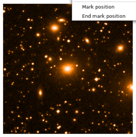
Fig. 39 Mark position Context Menue Entry
Graphical Elements Library
The Graphical Elements Library can be used to add overlay elements to the image displayed in the Image Widget.
Overlay elements are implemented as elements of the class
DdtGraphicalElement which is derived from the class QGraphicsItem.
The Image Widget can then add those Graphics Items to the QGraphicsScene.
The Graphical Elements are defined by the DdtOverlayType:
Overlay Type ID |
Meaning |
|---|---|
DDT_OVERLAY_ELLIPSE |
Ellipse objects |
DDT_OVERLAY_RECTANGLE |
Rectangle objects |
DDT_OVERLAY_CROSS |
Cross objects |
DDT_OVERLAY_TEXT |
Text overlays |
DDT_OVERLAY_LINE |
Line overlays |
DDT_OVERLAY_SLIT |
Slit element |
DDT_OVERLAY_STAT_RECTANGLE |
Resizable rectangle for image statistics |
DDT_OVERLAY_COMPASS |
Compass object |
DDT_OVERLAY_IMAGE |
Image object (supporting transparent background) created from an image file |
The overlay elements used are stored in an object of the type
DdtGraphicalOverlay.
This class offers a number of public functions that can be used to handle overlay objects in the Image Widget (which holds an instance of this class):
API function |
Description |
|---|---|
A ddGraphicalElement( DdtGraphicalElement* element) |
Adds a new overlay object to the scene. |
RemoveGraphicalElement( DdtGraphicalElement* element) |
Removes an overlay object from the scene. |
QList<DdtGraphicalElement*>* GetListOfGraphicalElements() |
Returns a list of all overlay objects in the scene. |
QList<DdtGraphicalElement*> GetElementByTag(const QString tag) |
Return a list of graphical elements with a given tag that are contained in the overlay. |
void ShowAllElements() |
Show all overlay elements. |
void HideAllElements() |
Hides all overlay elements |
void ShowElementsOfType(const DdtOverlayType type, const bool showIds = false, const QString id_list = “”) |
Show all overlay elements of a given type. |
void HideElementsOfType(const DdtOverlayType type) |
Hide all overlay elements of a given type. |
void ShowElementsOfTag(QString tag) |
Show all overlay elements of a given tag. |
void HideElementsOfTag(QString tag) |
Hide all overlay elements of a given tag. |
RemoveElementsOfType( DdtOverlayType type) |
Remove all overlay elements of a given type. |
The graphical overlay contains DDT Graphical Elements. Each of these elements allow to define their position by specifying the x/y coordinates. The following example demonstrates this for the graphical element of type ellipse. Here the position of the ellipse is set to (100, 100).
graphical_overlay = self.ui.ddtImageWidget.get_graphical_overlay();
prop = DdtGraphicalElementProperties();
ellipse = DdtGraphicalElementEllipse(prop, 100, 100, 50, 20);
graphical_overlay.AddGraphicalElement(ellipse);
self.ui.ddtImageWidget.RedrawOverlay();
The overlay API can also be accessed graphically by using the DDT Graphical Elements dialog (see 3.3.2.2.8)
Note that the graphical elements of type DDT_OVERLAY_IMAGE are not
accessible via the DDT Graphical Elements dialog. These objects are
generated out of image files from disc. This feature of image overlays
supports image formats with transparent background (e.g. the PNG
format).
Static Graphical Overlay
The DDT supports displaying static graphical elements which are loaded from a file at startup. These static graphical elements differ from those that can be drawn using the DDT Graphcial Elements Dialog in such, that they cannot get edited (resized or moved) and they cannot get deleted. Hence, the resizing corners will not appear around those elements when activating the selecting mode (as described in section 3.3.2.2.8).
In order to load a static overlay, the DDT Viewer needs to get started using a specific commandline argument:
--overlay <path_to_json_file>
An example for this could be:
ddtViewer --filename /ddt/data/images/16bit/ngc1275.fits --overlay
/ddt/data/images/overlay/overlay.json
The user can hide or show the complete static overlay by using the
context menu. Therefore, the context menu provides an entry Hide Static
Overlay which is disabled if the DDT Viewer is started without an
overlay file specified. If the DDT Viewer is started using the
--overlay parameter the entry gets enabled. When hiding the overlay,
the context menu entry changes to Show Static Overlay and the user can
show the overlay again. Furthermore, the Remote Control Interface
supports loading the overlay file (see section 3.3.2.6). The Static
Overlay will disappear if the image is cleared or if a binary table is
loaded. It is possible to start the DDT Viewer with an overlay file but
without having an image specified. In that case the DDT Viewer will
display the overlay file even though no image was loaded.
Overlay file format
The overlay file needs to get provided to the DDT Viewer in the JSON
format. It has to consist of a node called overlay which must contain
the array imageWidget. Image widgets are specified by a name name of
type string and an array of objects object.
Objects are identified by a name name of type string and they may
contain a show property of type boolean. This can be used to control
the visibility. If set to false the object will be ignored when the file
is loaded at startup. There is no need to specify the show attribute
at all since it will be set to true by default. Objects furthermore
contain an array of elements element. This format allows to have
multiple image widgets in the same file and multiple objects per image
widget.
The elements are specified by a type type (array), a name name
(string), the show flag show (boolean) and by properties properties
(array). The show flag is again optional and behaves the same as for
objects.
The type node specifies the element type. Possible types are
rectangle, ellipse, cross, line and text:
A rectangle must contain
x,y,widthandheight(all of type number).An ellipse must contain
x1,y1,x2andy2(all of type number).A cross must contain
x1,y1,x2andy2(all of type number).A line must contain
x1,y1,x2andy2(all of type number).A text must contain
text(string),x(number) andy(number).
The properties object offers the possibility to specify in detail how
an element shall be formatted. There is no need to provide any property
since the graphical elements have default values which will be used for
not-specified properties. The properties object may contain the
following entries:
lineWidth(integer) specifies the line width in px. Default is 1.
lineColour(string) specifies the line colour. The following colours are supported:white,black,red,darkRed,green,darkGreen,blue,darkBlue,cyan,darkCyan,magenta,darkMagenta,yellow,darkYellow,gray,darkGray,lightGray. Default iswhite.
lineStyle(string) specifies the line style. The following styles are supported:solid,dashed,dotted,dashDotted. Default issolid.
fillColour(string) specifies the fill colour of the brush. The same colours are supported as forlineColour. If no fill colour is specified, Qt::NoBrush is used as default.
fontFamily(string) specifies the font family. All fonts are supported that are available in the underlying window system. Default isSans Serif.
fontSize(integer) specifies the size of the font. Default is 12.
fontWeight(string) specifies the weight of the font. The following weights are supported:thin,extraLight,light,normal,medium,demiBold,bold,extraBold,black. Default isnormal.
fontStyle(string) specifies the style of the font. The following styles are supported:italic,normal. Default isnormal.
rotationAngle(number) specifies the rotation angle in degree. Default is 0.
It is up to the user to make sure that the properties contain reasonable
values. If for example pink is specified as line colour, this is
ignored and the default value is used instead. However, if the file is
malformed and an error occurs while parsing the overlay file, a message
box appears that displays a message specifying the error that has
occured. In this case the whole overlay file is rejected and no
graphical elements will be shown. An example error message is shown in
Figure 36.

Fig. 40 Example error message when parsing has failed
An example for an overlay file could look like this:
{
    "overlay": {
        "imageWidget": [
            {
                "name": "ddtImageWidget",
                "object": [
                    {
                        "name": "Slit",
                        "show": true,
                        "element": [
                            {
                                "type": {
                                    "rectangle": {
                                        "x": 100,
                                        "y": 120,
                                        "width": 100,
                                        "height": 50
                                    }
                                },
                                "name": "rectangle 1",
                                "show": true,
                                "properties": {
                                    "lineWidth": 8,
                                    "lineColour": "green",
                                    "lineStyle": "dotted"
                                }
                            },
                            {
                                "type": {
                                    "text": {
                                        "text": "Example",
                                        "x": 120,
                                        "y": 70
                                    }
                                },
                                "name": "text 1",
                                "show": true,
                                "properties": {
                                    "fontFamily": "FreeMono",
                                    "fontSize": 18,
                                    "fontStyle": "italic",
                                    "lineColour": "cyan"
                                }
                            }
                        ]
                    }
                ]
            }
        ]
    }
}
In the example the elements for one image widget (imageWidget) are
provided specified by the name ddtImageWidget. Within this image
widget one object (object) is specified with the name Slit. This
object contains two elements (element), one of type rectangle and
one of type text. Depending on the specified fits image the above
specified example can be seen in Figure 37:
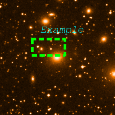
Fig. 41 Static overlay example
API
Several API functions are provided in order to control the visibility of the static overlay. These public functions are part of the class DdtOverlayRendering and are listed in Table 50.
API function |
Description |
|---|---|
HideStaticOverlay() |
Hides the whole static overlay. |
ShowStaticOverlay() |
Shows the whole static overlay. |
HideOverlayByObject(const QString object_name) |
Hides a specified object of the overlay. |
ShowOverlayByObject(const QString object_name) |
Shows a specified object of the overlay. |
HideOverlayByElement(const QString element_name) |
Hides an element of the overlay specified by its name. |
ShowOverlayByElement(const QString element_name) |
Shows an element of the overlay specified by its name. |
DDT Standard Viewer
The DDT Standard Viewer is a reference implementation of a DDT Subscriber GUI using all of the existing DDT Widgets.
In the current version the DDT Standard Viewer is mainly displaying one Image Widget plus some auxiliary widgets that are connected to the Image Widget.
Via the context menu of the Image Widget the user can access a number of DDT Dialogs plus a File Open dialog which allows loading FITS files from disk.
The functionality of the widgets and dialogs was described in detail in the sections above.
Fig. 42 DDT Standard Viewer
The Standard Viewer can be started from the command line using the command:
ddtViewer [--filename=<path to image file> OR --localbroker_uri=<URI of local datastream>]
[--remotebroker_uri=<URI of remote datastream>] [--datastream <name of datastream>]
[--remotecontrol_uri <server URI for remote control>] [--debug]
The viewer can either be started giving the path to an image file (in JPEG or FITS format). This image will be loaded at start up.
The other option is to give the URI string to a Data Stream. This will start the viewer automatically attaching it to the given data stream. The two arguments are mutually exclusive.
The URI has the syntax:
<Local Broker URI> <Data Stream> [<Remote Broker URI> <Remote Control URI>]
An example for this would be:
--localbroker_uri “zpb.rr://127.0.0.1:5001” --datastream "stream1"
The debug option can be set in order to set the log level temporarily to DEBUG.
With the default scale option the default scale factor for loading new images can be defined.
The timestamp option can be used when attaching to a data stream for debugging purpose. When the argument is set to 1, the originator timestamp of each data sample will be displayed in the upper left corner of the image. In addition the time difference between the local system clock and the originator timestamp will be displayed in milliseconds (this difference is only useful, when both the publisher server and the viewer machine are time synchronous.)
The optional argument remotecontrol_uri will be described in the next
section.
Remote Control Interface
The DDT Viewer provides an optional commandline argument for launching a
remote control server. By adding the argument --remotecontrol_uri
<URI> the DDT Viewer will start a CII MAL server on the specified URI
and can receive and process commands from a CII MAL client.
An example on how to start the Viewer with a remote server would be:
ddtViewer --remotecontrol_uri zpb.rr://*:5010
The Viewer will then print the following log message: Remote Control
Server ready Once the Remote Server was started, Remote Clients can
connect to it and trigger commands that will be executed. Therefore, the
Remote Control Interface allows clients to call the following function:
Function |
Arguments |
Return Type |
Description |
|---|---|---|---|
HandleRemoteCommand |
image_widget_name, command_name, command_arguments |
std::future<string> |
Handles the command sent by remote clients. The name of the image widget, the command and its arguments need to get specified. |
The function will return a response as a string. The following commands are supported and handled by the Remote Control library:
Remote command |
Arguments |
Description |
|---|---|---|
list_commands |
Lists all supported remote commands and their arguments. |
|
attach |
<URI> <Data Stream ID> |
Attaches the Image Widget to a data stream specified by the Broker URI and the Data Stream ID. |
detach |
Detaches the Image Widget from the currently connected data stream. |
|
flip |
h / v |
Flips an image horizontally [h] or vertically [v]. |
rotate |
c / a |
Rotates an image clockwise [c] or anticlockwise [a]. |
zoom |
i / o / d |
Zooms an image one step in [i], one step out [o], or zooms to the default value [d]. |
scale |
f / d / <factor> |
Changes the scale of an image to FIT [f], default scale [d], or to a specified factor in the range [1/20, 20]. |
select_points |
Triggers the ‘Mark position’ feature of the Viewer. |
|
statistics |
Starts the Statistics dialog. |
|
tabular |
Starts the Tabular dialog. |
|
scale_rotate_cut |
Starts the Scale Rotate Cut dialog. |
|
slit |
Starts the Slit dialog. |
|
pick |
Starts the Pick Object dialog. |
|
load |
<file [HDU_index]> |
Opens a specified file in the Viewer. |
distance |
Starts the Statistics dialog. |
|
overlay |
<file> |
Loads the specified file and displays the overlay elements in the Viewer. |
If a Remote Control Server is currently processing a remote command, it will reject commands from other Remote Clients.
Provided response messages
Some of the commands listed in the previous section open a dialog in the
DDT Viewer which returns values when the user triggers a response, e.g.
by clicking the Ok button. The values received by a Remote Client will
be in the same format as they are provided by the corresponding dialog.
The following table provides an overview of those commands and their
response format.
Remote command |
Response description |
|---|---|
select_points |
Returns a point list of (x, y) pairs when the user clicks ‘End mark position’ in the Viewer. |
statistics |
Returns statistic values in the following order when the user clicks ‘Ok’: MIN, MAX, MEAN, RMS, PIXELS, STARTX, STARTY, ENDX, ENDY |
slit |
Returns slit values in the following order when the user clicks ‘Ok’: X Offset, Y Offset, Target X, Target Y, Slit X, Slit Y |
pick |
Returns information about a picked object in the following order when the user clicks ‘Confirm’: Image Coord X, Image Coord Y, Pixelvalue, RA, DEC, Equinox, FWHM X, FWHM Y, Angle of X axis, Peak above Bg., Background, Pixels in X / Y |
distance |
Returns distance values in the following order when the user clicks ‘Confirm’: X OFFSET, Y OFFSET, START X, START Y |
Remote Client Interface
A Remote Client can be created using the MAL framework. The following pseudo-code snippet gives an example on how a Remote Client can be realized.
// Asynchronous MAL client with ReplyTime QoS set.
auto client = factory.getClient<remotecontrol::RemoteControlRegistrationAsync>(
    uri,
    { std::make_shared<mal::rr::qos::ReplyTime>(std::chrono::seconds(6)) },
    {}
);

// Explicitly wait for connection to be established.
auto connection_future = client->asyncConnect();
auto future_status = connection_future.wait_for(boost::chrono::seconds(10));
bool connected = (future_status == boost::future_status::ready);

if (connected) {
    std::cout << "Server connection established" << std::endl;
} else {
    std::cout << "Server connection failed" << std::endl;
}

std::string response = "";

try {
    // Get response, future will block if the response is not yet received,
    // or TimeoutException is thrown if reply-time is exceeded.
    mal::future<std::string> future = client->HandleRemoteCommand(image_widget, command, arguments);
    std::cout << "Waiting for response..." << std::endl;
    response = future.get();
} catch (std::exception&) {
    if (timeout == 0) {
        // no wait requested, don't do anything
        response = "Command sent, not waiting for server response";
    } else {
        response = "Configured timeout elapsed";
    }
    // make server available for new commands
    mal::future<std::string> future = client->HandleRemoteCommand(image_widget, "stop_remote", arguments);
    future.get();
}
Remote Control Servers can only process a single remote command one at a
time. Since such a command may require some interaction by the user of
the DDT Viewer, it may happen that a Remote Client stops (e.g. by
running into a timeout) before the user has finished the action. In
order to unblock the Remote Server and make it accessible for new
commands, developers should make use of the stop_remote command. This
command releases the corresponding promise object in the Remote Control
Server (see pseudo-code above as an example).
Remote Client Example Application
The DDT provides a sample tool called Remote Client. The Remote Client is a command line application that can be used to connect to a Remote Control Server started by a DDT Viewer. The Remote Control Server can be either running on the same or on a different host than the Remote Client.
The Remote Client can be started using the command line:
ddtRemoteClient -s <URI of the Remote Control Server> -i <image widget
name> -c <command name> -a <arguments> [-t <timeout in sec>]
[--infinite] [--debug]
The following example command can be used to flip an image horizontally:
ddtRemoteClient -s zpb.rr://127.0.0.1:5010 -i ddtImageWidget -c flip -a h
Once started the Remote Client will wait for a server response until a
timeout is reached (specified via the --timeout parameter in seconds).
If not specified the timeout is set to a default value of 3 seconds. The
timeout can be set to 0 if it is not desired to wait for a server
response. Specifying the --infinite flag will set the timeout to 24
hours (the --timeout parameter is overwritten in case it is specified
in addition to the --infinite flag). The Remote Client will
automatically close if the timeout was reached or a response of the
Remote Control Server was received. In addition it can be closed by
pressing CTRL+C.
The Remote Client also supports the command line argument:
ddtRemoteClient --help
Rendering Libraries
Image data that is being displayed in the Image Widget will be using a rendering function from a separate Rendering Plugin library. The library can create different representation of the same type of image data.
All rendering functions should be derived from a common rendering plugin
class called DdtRenderingPlugin. This class will create a
DdtImageGraphicsItem which can then be added to the QGraphicsScene
used to display the image data in the Image Widget. Here the
DdtImageGraphicsItem is again the base class for graphics items
derived from QGraphicsItem.
The two classes have the following interface functions:
Function Name |
Return Type |
Arguments |
Description |
|---|---|---|---|
CreateGraphicsItem |
DdtImageGraphicsItem* |
cpl_image* image, ddt::colorMap_t* color_map, ddt::scalingLut_t* scaling_lut |
Creates a DdtImageGraphicsItem from a CPL image, a colour map, and a scaling lut. |
CreateGraphicsItem |
DdtImageGraphicsItem* |
cpl_image* image, ddt::colorMapARGB_t* color_map, ddt::scalingLut_t* scaling_lut |
Creates a DdtImageGraphicsItem from a CPL image, a colour map containing ARGB values, and a scaling lut. |
CreateGraphicsItem |
DdtImageGraphicsItem* |
QString filename, int width, int height, |
Create a DdtImageGraphicsItem from an image file. The width and height give the size of the rendering area. |
CreateImage |
DdtImageGraphicsItem* |
std::vector<uint16_t> image_data, int width, int height |
Creates a DdtImageGraphicsItem from a data sample (data received as std::vector of uint16_t values). The width and height give the size of the rendering area. |
GetRenderingPluginID |
int |
Returns the ID of the rendering plugin. |
Function Name |
Return Type |
Arguments |
Description |
|---|---|---|---|
boundingRect |
QRectF* |
Returns the bounding rectangle of the graphics item created. |
|
paint |
void* |
QPainter* painter, const QStyleOption GraphicsItem* option, QWidget* widget |
Method that will be used to render the graphics item. Arguments are the QPainter used to draw the item, the QStyleOptionGraphicsI tem for the style options and the pointer to the parent QWidget. |
GetImage |
QImage* |
Returns the current graphics item as QImage. |
|
type |
int |
Returns the type of the graphics item. |
When the user plans to create a new rendering plugin for the Image
Widget proper classes that implement the interfaces of the
DdtRenderingPlugin and the DdtImageGraphicsItems need to be implemented.
When an Image Widget was instanciated the method:
ImageWidget::AddRenderingPlugins(DdtRenderingPlugin* const new_plugin)
can be used to add the new rendering plugin to the Image Widget. Once loaded the rendering plugin can be activated using the method:
ImageWidget::SetActiveRenderingPlugin(const int rendering_plugin_id)
Each rendering plugin should define its own plugin ID so the selection is unambiguous.
Image Handling
The Image Handling provides image processing capabilities that can be accessed by a simple API. It makes use of the ESO Common Pipeline Library (CPL) for image processing. The functions provided are roughly divided into the following domains:
I/O: handle access to the filesystem, i.e. reading and writing images in the FITS file format
Image Processing: provide operations like flip, rotate, cut level application, configurable map support etc.
Arithmetical Computations: provide basic arithmetical operations like addition, subtraction, multiplication, division.
Analysis & Statistics: provide statistical information like min / max, mean, RMS, sigma, FWHM, circular object detection etc.
Coordinate Conversion: convert between coordinate systems and between image and canvas coordinates
The starting point to use the Image Handling library would be the
instantiation of an object of the class ddt::ImageHandling() (see sample
code below). This object then offers functions to attach to a data
stream, to open a data file, to access the image data and perform
various operations on these data:
ddt::ImageHandling* imgHandling = new ddt::ImageHandling();
imgHandling->LoadColorMaps(colourmap_directory, default_colourmap);
imgHandling->LoadFile(filename);
imgHandling->ReprocessImage();
cpl_image* image = imgHandling->get_Image();
Note: Please see the doxygen documentation of the source code for a detailed description of the image handling.
Python Bindings
The Python bindings can be used to access the public API of the DDT software. They are created using pybind11 and Shiboken2 or Shiboken6. In total six Python modules containing the bindings for the DDT software are provided. This chapter will give an overview over the modules and how they can be used.
The data transfer components are divided into the module DdtDataBroker
for creating a Python broker, and the DdtDataTransfer, which contains
everything needed to create a Python publisher and subscriber.
Module |
Classes |
|---|---|
DdtDataBroker (pybind11) |
DdtDataBroker |
DdtDataTransfer (pybind11) |
DataSample |
DdtDataPublisher |
|
DdtDataSubscriber |
|
DdtEncDec |
|
DdtEncDecBinaryxD |
|
DdtEncDecImage2D |
|
DdtEncDecImage3D |
|
MetaDataBase |
|
MetaDataElementsBinaryxD |
|
MetaDataElementsImage2D |
|
MetaDataElementsImage3D |
|
WcsInformation |
The data visualisation components are divided in two modules as well.
The widgets, dialogs and graphical elements can be found in the module
ddtWidgets and in ddt.widgets. Whereas the remote control components
are provided in the module DdtRemoteLib.
The image handling components that are needed for creating Python widgets and dialogs can be found in the module ddtImageHandling.
Module |
Classes/Functions |
|---|---|
ddtImageHandling (Shiboken2/Shiboken6) |
InitCpl() |
EndCpl() |
|
ImageHandling |
|
CutLevelType |
|
ColorScalingType |
At last there are also some utility components needed in Python, especially the DdtLogger, which can be imported via the DdtUtils module.
Module |
Classes |
|---|---|
DdtUtils (pybind11) |
DdtLogger |
DdtStatistics |
Data Transfer Module
The core of this module are the bindings for the DdtDataPublisher and
the DdtDataSubscriber which provide the possibility to create Python
publisher and subscriber. A list of available methods can be found in
3.3.1.1. The only difference is the construction of the DdtDataPublisher
/ DdtDataSubscriber, since no factory is used on the Python side (see
section Example Usage below).
The module also contains bindings for the DataSample which is returned
by the ReadData() method of the subscriber. Its constructor takes three
input values: The ID of the sample, the length of the meta data vector
and the length of the data vector. The fields, which can be seen in the
code snippet below, are all accessible from Python side. Instead of
std::vector a python list is used in Python code, which gets
automatically translated.
// Topic ID to identify the kind of meta data
int32_t topic_id;

// The length of the meta data blob
int32_t meta_data_length;

// The meta data as vector of bytes
std::vector<uint8_t> meta_data;

// Sample ID to uniquely identify the data sample
int32_t sample_id;

// The image data as vector of bytes
std::vector<uint8_t> data;
Attributes of the DataSample class
The meta data used by the DataSample can be created by using the bindings of one of the classes
DdtEncDecBiDim, DdtEncDecMultiDim or DdtEncDecMultiLayer. Alternatively,
the class DdtEncDec can be extended. For encoding the meta data the
classes provide the encode(...) method which also adds a UTC timestamp to
the meta data vector. These vectors can be decoded with the
decode(length, metaData) method, which takes the length of the meta data
vector and the vector itself as input. After encoding or decoding the
values can be accessed via the corresponding gettermethods of the
classes.
For the connection management the module also contains bindings for
boost::signals2::connection. The connection is returned by the method
connect() of the DdtDataSubscriber. The only bound method however is
disconnect() which closes the connection and removes the subscriber from
the list of listeners for available data.
Example Usage
For using the bindings, both the DdtUtils and the DdtDataTransfer
modules must be imported. When creating a subscriber (DdtDataSubscriber)
or a publisher (DdtDataPublisher), a logger (DdtLogger) needs to be
instantiated before.
logger = DdtLogger("DdtPublisherSimulator")
publisher = DdtDataTransfer.DdtDataPublisher(logger)
Before registering the publisher to the broker, the size of the buffer needs to be set. Otherwise the registration will fail.
The subscriber needs to receive the DataAvailable signal. To bind a
method to this signal, which is called each time new data arrives, the
connect method of the subscriber needs to be called with the call-back
method as argument.
def process_new_data():
    # process data here

connection = subscriber.connect(process_new_data)
For sending data from the publisher to the subscriber the publisher
needs to write data and explicitly publish it. After calling the
publishData method the call-back method of the subscriber will be
called.
A full example for a python publisher is as follows (note: this could be started by passing the URI and the data stream identifier as arguments):
import sys
import signal
import time
import DdtDataTransfer
from DdtUtils import DdtLogger
from DdtDataTransfer import DdtEncDecImage3D
from DdtDataTransfer import MetaDataElementsImage3D

def create_metadata():
    md = MetaDataElementsImage3D()
    md.meta_data_base.bytes_per_pixel = 2
    md.meta_data_base.number_dimensions = 2
    md.meta_data_base.complete_flag = 1
    md.meta_data_base.last_segment = 1
    md.meta_data_base.byte_order_little_endian = 1
    md.meta_data_base.data_type = 1
    md.meta_data_base.description = "description"
    md.number_pixels_x = 353
    md.number_pixels_y = 353
    md.binning_factor_x = 1
    md.binning_factor_y = 1
    md.number_layers = 1
    md.item_size = 1

    return md

def create_data():
    data = [0, 0, 0]

    return data

def signal_handler(sig_num, frame):
    logger.write(2, "Ctrl-c was pressed. Exit now.")

    exit(1)

.. _figure__name__ == "__main__":
    signal.signal(signal.SIGINT, signal_handler)

    uri = sys.argv[1]
    dsi = sys.argv[2]

    logger = DdtLogger("DdtPublisherSimulator")
    logger.write(2, "Starting DdtPublisherSimulator...")

    # create and register a publisher
    publisher = DdtDataTransfer.DdtDataPublisher(logger)
    publisher.SetBufferSize(1000, 10)
    publisher.RegisterPublisher(uri, dsi)
    logger.write(2, "Publisher registered.")

    # create sample data
    data = create_data()

    # create encoder
    enc_dec = DdtEncDecImage3D()

    # create sample descriptions for the metadata
    descriptions = ["Mars", "Jupiter", "Saturn"]
    counter = 0
    while True:
        # create metadata
        md = create_metadata()

        # change description field
        md.meta_data_base.description = descriptions[counter % len(descriptions)]

        # encode the metadata
        enc_dec.Encode(md)

        # write and publish data
        publisher.WriteData(counter, data, enc_dec.get_meta_data())
        publisher.PublishData()

        # increment counter and go to sleep
        counter += 1
        time.sleep(0.5)
A full example for a python subscriber is as follows (note: this could be started by passing the URI and the data stream identifier as argument):
import sys
import signal
import time
import DdtDataTransfer
from DdtUtils import DdtLogger
from DdtDataTransfer import DdtEncDecImage3D

def process_new_data():
    # read the data sample
    sample = subscriber.ReadData()
    logger.write(2, "topic id: " + str(sample.topic_id))
    logger.write(2, "meta data length: " + str(sample.meta_data_length))
    logger.write(2, "sample id: " + str(sample.sample_id))

    # create decoder and decode the metadata
    enc_dec = DdtEncDecImage3D()
    enc_dec.Decode(sample.meta_data_length, sample.meta_data)
    logger.write(2, "UTC timestamp: " + enc_dec.get_utc_timestamp())
    logger.write(2, "Description: " + enc_dec.get_description())
    logger.write(2, "Bytes per pixel: " + str(enc_dec.get_bytes_per_pixel()))
    logger.write(2, "Number pixels x: " + str(enc_dec.get_number_pixels_x()))
    logger.write(2, "Number pixels y: " + str(enc_dec.get_number_pixels_y()))
    logger.write(2, "Complete flag: " + str(enc_dec.get_complete_flag()))
    logger.write(2, "Last segment: " + str(enc_dec.get_last_segment()))
    logger.write(2, "Binning factor x: " + str(enc_dec.get_binning_factor_x()))
    logger.write(2, "Binning factor y: " + str(enc_dec.get_binning_factor_y()))
    logger.write(2, "Number layers: " + str(enc_dec.get_number_layers()))

def signal_handler(sig_num, frame):
    logger.write(2, "Ctrl-c was pressed.")

    subscriber.UnregisterSubscriber()
    logger.write(2, "DdtSubscriberSimulator unregistered. Exit now.")

    exit(1)

.. _figure__name__ == "__main__":
    signal.signal(signal.SIGINT, signal_handler)

    uri = sys.argv[1]
    dsi = sys.argv[2]

    logger = DdtLogger("DdtSubscriberSimulator")
    logger.write(2, "Starting DdtSubscriberSimulator...")

    # create and register a subscriber
    subscriber = DdtDataTransfer.DdtDataSubscriber(logger)
    subscriber.RegisterSubscriber(uri, dsi)
    logger.write(2, "Subscriber registered.")

    # bind a method that is called each time new data arrives
    connection = subscriber.connect(process_new_data)
    while True:
        time.sleep(1)
Broker Module
The DdtDataBroker module contains python bindings for starting a broker
with python. The module contains the class DdtDataBroker with the
following methods:
Run(...)
    Run(self: DdtDataBroker.DdtDataBroker) -> int

__init__(...)
 .. _figure__init__(self: DdtDataBroker.DdtDataBroker) -> None

setup(...)
    setup(self: DdtDataBroker.DdtDataBroker, arg0: List[str]) -> bool
The setup(...) method takes a list of arguments as parameters. The valid
arguments are the same as described in the Data Broker section. The
method returns true if the arguments could be parsed without any error,
otherwise it returns false.
After calling the setup(...) method the Run(...) method can be called to
start the broker. If the application is terminated it returns 0.
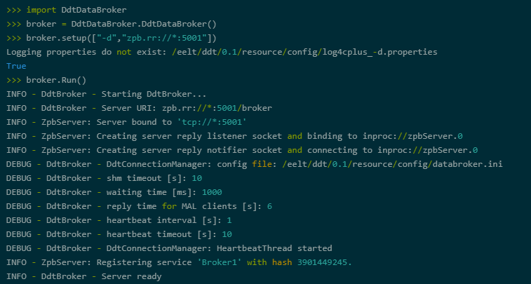
Fig. 43 Example for Python Broker
Another example for a Python script can be found under
ddt/py/brokerlib/src/pyDdtBroker.py. The script can be started by
executing python3 pyDdtBroker.py zpb.rr://*:5001. This will start a
broker with the specified arguments.
Data Visualisation Module
The bindings for the data visualisation component of the DDT software
are created with Shiboken2 or Shiboken6. The Python module containing
the bindings is called ddtWidgets and consists of the widgets, the
dialogs and the graphics libraries. For convinience the widgets
are also present in the ddt.widgets. We recommend the use of this
module. The following sections describe how to use them to
create a Python viewer.
Creating The UI File
To build a viewer, a UI file must first be created. This can be done
with the Qt Designer or Qt Creator tool. The UI file needs to belong to
a wtools declare_pyqtprogram or declare_pyqtmodule src files.
WAF will automatically detect the presence of UI files and generate the
code for the UI.
A full example can be found under ddt/py/ddtviewer.
Creating The Viewer
A full implementation of a Python viewer containing all the examples of
this section can be found under ddt/py/ddtviewer/src/pyDdtViewer.py.
A viewer application will need to import several libraries from the project.
Module |
|
|---|---|
ddtImageHandling |
Needed for initializing the CPL library |
ddt.widgets |
Only needed if dialogs shall be part of the viewer |
DdtUtils.DdtLogger |
The logger is needed by some widgets |
ui_file.Ui_FileForm |
The class generated in the step before |
DdtRemoteLib |
Only needed if the viewer shall support remote commands |
Beside these some PySide2 or PySide6 libraries like QApplication, QMainWindow,
QObject and Signal will have to be imported. The complete list depends
on what the viewer shall support.
In the constructor multiple steps need to be performed. The parent object needs to be initialized, the UI object created an configured to work with the application. Also the logger object needs to be created and configured and the CPL library initialized.
super(PyDdtViewer, self).__init__()
self.ui = Ui_DdtViewerForm()
self.ui.setupUi(self)
self.logger = DdtLogger("DdtStandardViewer")
self.logger.configure("DdtStandardViewer")
ddtImageHandling.InitCpl()
Thereafter the signals and slots of the widgets need to be connected. An overview of the signals and slots of each widget can be found in the widgets section in this document. An example of a connection looks as follows:
QObject.connect(self.ui.ddtImageWidget,
                SIGNAL("CursorInfo(double, double, double, QString, QString)"),
                self.ui.ddtCursorInfoWidget.CursorInfo)
The viewer itself can also connect to several slots of the image widget.
For connecting to them an object of the type Signal needs to be created
which then can be connected to the slot via the connect(...) method. The
Signal class has also a method called emit(...) which can be used to call
trigger the slot.
set_filename = Signal(object) // create a Signal object
self.set_filename.connect(self.ui.ddtImageWidget.AttachDataFile) // attach it to the slot
self.set_filename.emit(filename) // trigger the slot
The Signal class can be imported from PySide6.QtCore or PySide2.QtCore.
The table below shows the slots that are used in the python viewer example
implementation.
Slot |
|
|---|---|
self.ui.d dtImageWidget.AttachDataFile |
Used for loading a file. |
self.ui.ddt ImageWidget.AttachDataStream |
Used for connecting to a data stream. |
self.ui .ddtImageWidget.DetachStream |
Used for disconnecting from a data stream. |
self.ui.ddt ImageWidget.SetNoWaitNewData |
Used for switching immediate display of new data on/off. |
self.ui. ddtImageWidget.SetImageScale |
Used for setting the image scaling factor. |
Dialogs have to be created in the viewer and then added to a map containing all dialogs. This map is then given to the image widget object to initialize the dialogs.
dialog_map = {}
dialog_map["ddtHDU"] = DdtDialogFactory.createDialog("ddtHDU")
self.ui.ddtImageWidget.InitializeDialogMap(dialog_map)
The viewer class needs to implement the method closeEvent(…) which is automatically called when the viewer closes. In this method all dialogs should be closed and the connection to a data stream disconnected.
def closeEvent(self, event):

    if self.ui.ddtImageWidget:
        self.ui.ddtImageWidget.CloseAllDialogs()

    self.detach_datastream.emit()
Image Handling Module
The module ddtImageHandling consists of python bindings of the image
handling library that are necessary for creating a python viewer. These
are in particular the methods InitCPL() and EndCPL() for initializing
and respectively terminating the CPL core library.
Further the module contains the class ImageHandling in which the
enumerations CutLevelType and ColorScalingType are declared, with the
first being used in the bindings for the widgets.
Remote API Module
The bindings for the remote API are contained in the module
DdtRemoteLib. It consists of two classes, DdtRemoteClient and
DdtRemoteControl.
The first can be used for starting a remote client application, as
demonstrated in the image below. The setup(...) method of DdtRemoteClient
receives the command line arguments which the remote client application
needs. These are described in further detail in the Remote Control
Interface section of this document. If all parameters could be parsed
successfully the method returns true and the command can be executed by
calling the Run() method.
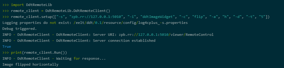
Fig. 44 Example for Python remote client
An example for a Python script that starts a remote client application can be found under:
ddt/py/remoteapi/src/pyDdtRemoteClient.py. The script can be executed with for example the following
command in the specified directory:
python3 pyDdtRemoteClient.py -s zpb.rr://127.0.0.1:5010 -i ddtImageWidget -c flip -a h -d -t 5
The second class, DdtRemoteControl, is used for implementing the remote control functionality into a
python viewer.
self.remote_control = DdtRemoteLib.DdtRemoteControl(remotecontrol_uri, self.logger)
self.remote_control.StartRemoteControlServer()
self.remote_control.connect_remote_command_signal(self.process_remote_command)
self.ui.ddtImageWidget.ConnectRemoteResponseSignal(self.remote_control.ProcessResponse)
After creating the remote control object StartRemoteControlServer()
needs to be called. Thereafter the signals and slots need to be
connected.
The remote command signal needs to be connected with the slot that shall
be called when a remote command is triggered. This is done by calling
the connect_remote_command_signal(...) method with the user defined
function to call as parameter.
The response signal needs to be connected with the ProcessReponse(...)
method of the DdtRemoteControl object. This is achieved by calling the
ConnectRemoteResponseSignal(...) method of the image widget(s) with the
ProcessResponse(...) method of the remote control object as parameter.
The full example on how to implement the remote support into a Python
viewer application can be found under: ddt/py/datavisualisation/src/pyDdtViewer.py .
Configuration map handling
The configuration maps are stored in FITS file format. They contain for example the physical shape of DSM actuators:

Fig. 45 Physical Shape of DSM Actuators
When receiving a numerical array of values that are meant to be displayed using the configuration map, the pixel values from the configuration map are used as index into the numerical array.
An example: a pixel with coordinates x=100 and y=150 and a value of
index_val=234 in the configuration map will result in a pixel in the
displayed image with the same coordinates x and y and a pixel value of
numerical_array[index_val].
So, the resulting image will have the same dimension as the configuration map; the value range from the configuration map should then correspond to the number of values in the numerical array.
Beside the configuration map, it is possible to store information that
is displayed when hovering over the image in the image widget. This
information is stored in files in json format. For each value from the
configuration map, a list of information can be stored, where each entry
in the list consists of a name and a value. In the following example, a
numerical value named Numerical and a textual information named
Textual is stored for each value:
{
    "Values": {
        "Entry": [
            {
                "Value": 1,
                "Information": [
                    {
                        "Numerical": 1,
                        "Textual": "1"
                    }
                ]
            },
            {
                "Value": 2,
                "Information": [
                    {
                        "Numerical": 2,
                        "Textual": "2"
                    }
                ]
            },
            {
                "Value": 1156,
                "Information": [
                    {
                        "Numerical": 1156,
                        "Textual": "1156"
                    }
                ]
            }
        ]
    }
}
So, when hovering over the image, again the pixel value from the configuration map is used as index into the json file to get the information that is to be displayed as tooltip:
Fig. 46 Image Widget Tooltip
These information files have to be located together with the
configuration map files, where each information file has to have the
same filename as the corresponding configuration map file, but with the
file extension .json.
Standard viewer derivations
From the generated python code we have control to independently use the different widgets of the standard viewer. This way we can create viewers in Python without much effort.
DDT Multi Stream Viewer
The DDT Multi Stream Viewer allows the user to visualize multiple images from local files or from datastreams. Is compose with a configure number of DDT Image Widget that can be adjust as a matrix format. Each DDT Image Widget instantiated has independent dialogs that can be called (right click) like in DDT Standard Viewer.

Fig. 47 DDT Multi Stream Viewer
Usage
The DDT Multi Stream Viewer can be started from the command line using the command:
pyDdtMultiStreamViewer
Available Options
pyDdtMultiStreamViewer --help

    -d, --debug        by default logger prints WARNINGS and ERRORS messages only,
                       debug option turns on printing DEBUG/INFO messages also

    -m, --matrix TEXT  syntax: RxC, where R (rows) >= 1 and C (columns) >= 1,
                       sets arrangement of displayed images or datastreams inside the viewer,
                       by default it is 1x1 matrix - 1 image or datastream,
                       e.g. 'pyDdtMultiStreamViewer -m 4x3' will create 4 by 3 matrix
                       to display 12 images or datastreams in total

    --help             Show this message and exit.
DDT Plots Viewer
The DDT Plots Viewer allows the user to analyze data that comes from a datastream. Data comes from a datastream will be interpreted as a raw one dimensional array e.g. 2D image or multidimensional array will be also interpreted as a one dimensional array.
User can add/remove Data Stream Plots with the right click. Within each new row is possible to insert a valid URI, Data Stream Name and Receiving Frequency to start see information on the respective plot. Note that Receiving Frequency is independent from the frequency on the publisher side.
A part from that the usability is somehow intuitive.
There is an option to read initial configuration of the plots from a .json file.

Fig. 48 DDT Plots Viewer
Usage
The DDT Plots Viewer can be started from the command line using the command:
pyDdtPlotsViewer
Available Options
pyDdtPlotsViewer --help

    -d, --debug                   by default logger prints WARNINGS and ERRORS messages only,
                                  debug option turns on printing DEBUG/INFO messages also

    -b, --rolling_buffer INTEGER  Maximum number of the points that can be
                                  displayed at the same time on the X axis,
                                  by default it is 1000 points,
                                  e.g 'pyDdtPlotsViewer -b 10000'

    -c, --config_file TEXT        Path to the JSON configuration file that
                                  contains initial configuration of the plots,
                                  for more information, please look at the description above,
                                  e.g. 'pyDdtPlotsViewer -c config.json'

    --help                        Show this message and exit.
Configuration File
There is an option to read initial configuration of the plots from a .json file. In this example The DDT Plots Viewer will create 2 plots (Plot 1 and Plot 2) and try to connect to (zpb.rr://127.0.0.1:5001, data_stream_1) and (zpb.rr://127.0.0.1:5001, data_stream_2) automatically.
{
    "plots": [{
        "title": "Plot 1",
        "datastream": {
            "uri": "zpb.rr://127.0.0.1:5001",
            "name": "data_stream_1",
            "reading_interval": 1000
        }
    },
    {
        "title": "Plot 2",
        "datastream": {
            "uri": "zpb.rr://127.0.0.1:5001",
            "name": "data_stream_2",
            "reading_interval": 1000
        }
    }]
}