8. Utility Widgets
The utility widgets are small, general-purpose widgets that are used across different subsystems. They are found in two modules:
- ifw.wdglib.widgets.utils
Widget-level utilities such as disk space monitoring.
- ifw.wdglib.widgets.common
Shared components used by other widgets, such as collapse buttons and ROI configuration widgets.
8.1. DiskFreeWidget (ifw.wdglib.widgets.utils)
The DiskFreeWidget displays disk free space as a colored horizontal
progress bar. It does not require base_uri or dcs_db_prefix and has
no MAL dependencies.

DiskFreeWidget showing a colored horizontal progress bar for disk usage
- class DiskFreeWidget(parent=None)
- Args:
parent: Optional parent widget.
Methods:
set_disk_usage(percent_free, free_bytes, total_bytes=None, dir_path=None)– Update the bar with disk usage values. The bar colors itself green (>50%), orange (>15%), or red (<=15%).set_display_mode(mode)– Switch between"percent"and"gb"display modes.
The widget caches the last values passed to set_disk_usage() so that
switching display modes does not lose the current reading.
Example:
from pathlib import Path
import shutil

from ifw.wdglib.widgets.utils import DiskFreeWidget

disk_bar = DiskFreeWidget(self)
disk_bar.set_display_mode("percent")

# Update from a file path
file_path = Path("/path/to/recording/data.fits")
dir_path = file_path.parent
usage = shutil.disk_usage(str(dir_path))
percent_free = int(round((usage.free / usage.total) * 100))
disk_bar.set_disk_usage(percent_free, usage.free, usage.total, dir_path)

layout.addWidget(disk_bar)
8.2. CollapseButton (ifw.wdglib.widgets.common)
The CollapseButton is a checkable tool button that animates the
expand/collapse of an associated content widget. It is used internally by
CcfPipelineWidget to make recipe and publisher sub-widgets
collapsible.
- class CollapseButton(parent)
- Args:
parent: Parent widget.
Methods:
setContent(content: QWidget)– Attach the widget to collapse/expand. The content is hidden by default until the button is toggled on.setAnimationDuration(duration: int)– Set the animation duration in milliseconds.setChecked(state: bool)– Programmatically expand (True) or collapse (False) the content. This triggers the same animated transition as a user click.
The button shows a right arrow (collapsed) or down arrow (expanded) beside
its text. Animation uses QPropertyAnimation on the content widget’s
maximumHeight property with an ease-in-out curve.
Important: The CollapseButton and its content widget must be placed inside a layout that sits within a QScrollArea. The animation on maximumHeight changes the content widget’s size dynamically, which would otherwise cause the parent layout or window to resize or clip content. The scroll area absorbs these size changes smoothly.
Example:
from taurus.external.qt.QtWidgets import QScrollArea, QWidget, QVBoxLayout

from ifw.wdglib.widgets.common import CollapseButton

scroll_area = QScrollArea(self)
scroll_contents = QWidget()
scroll_layout = QVBoxLayout(scroll_contents)

collapse = CollapseButton(self)
collapse.setText("Publisher Settings")
collapse.setContent(publisher_widget)

scroll_layout.addWidget(collapse)
scroll_layout.addWidget(publisher_widget)

scroll_area.setWidgetResizable(True)
scroll_area.setWidget(scroll_contents)
Note
When multiple CollapseButton instances share the same layout inside
a QScrollArea, expanding one will not cause the window to resize.
Without the scroll area, each expand/collapse would trigger a full layout
recalculation of the parent container, resulting in visible window resizing
or content being clipped.
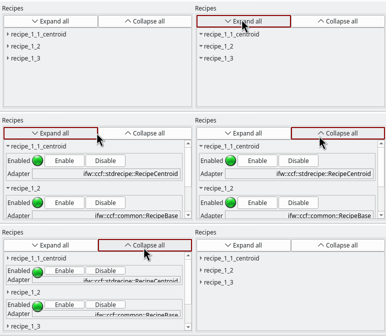
CollapseButton widgets expanding and collapsing within a QScrollArea
8.3. ReadoutWindowWidget (ifw.wdglib.widgets.common)
The ReadoutWindowWidget provides ROI (Region of Interest) window
configuration with Taurus-bound readout labels and spinboxes. It displays
current window values from OLDB and allows setting new values.
The widget emits a setWindowPressed signal (int, int, int, int)
when the “Set Window” button is clicked, carrying the X, Y, NX, NY values.
- class ReadoutWindowWidget(parent)
- Args:
parent: Parent widget.
Methods:
setWinModels(winXModel, winYModel, winNXModel, winNYModel)– Set all four OLDB models at once via convenience method.setWinXModel(model),setWinYModel(model),setWinNXModel(model),setWinNYModel(model)– Set individual OLDB models for X, Y, width, height. Logs a warning if the datapoint does not exist in OLDB.setMinimumValues(x=1, y=1, nx=0, ny=0)– Set individual minimum values for each spinbox.setMaximumValues(x=1, y=1, nx=0, ny=0)– Set individual maximum values for each spinbox.remove_bgrole()– Clear Taurus background color overrides for QSS theming.
The “Read From DB” button populates the spinboxes from the current Taurus label values. The “Set Window” button emits the signal with the spinbox values.
Example:
from taurus.external.qt.QtCore import Slot
from ifw.wdglib.widgets.common import ReadoutWindowWidget

win_wdg = ReadoutWindowWidget(self)

win_wdg.setWinModels(
    f"{dcs_db_prefix}/server/core/gateway1/win/sx",
    f"{dcs_db_prefix}/server/core/gateway1/win/sy",
    f"{dcs_db_prefix}/server/core/gateway1/win/nx",
    f"{dcs_db_prefix}/server/core/gateway1/win/ny"
)
win_wdg.setMinimumValues(x=1, y=1, nx=0, ny=0)
win_wdg.setMaximumValues(x=2048, y=2048, nx=2048, ny=2048)

@Slot(int, int, int, int)
def on_window_set(x, y, nx, ny):
    print(f"Window: x={x}, y={y}, nx={nx}, ny={ny}")

win_wdg.setWindowPressed.connect(on_window_set)
layout.addWidget(win_wdg)