Health Check monitor


Agora | CAL | HC | refs | QC
HealthCheck Monitor
    HOME | UsersGuide
MIDI:
detector characteristics
Other HC:
QC links:
[best viewing with style sheets and javascript enabled]
MIDI trending system: HEALTH CHECK plot
Last update: 2008-12-01T11:55:16 (UT)
now: 2008-12-02T23:42:20 (UT)
INFO USERS-GUIDE MORE
same group: RON LIN LIN_TEMP TEMP
history ... | plot tutorial ...   daily/often; important to check     [info]
last OPSLOG data:
2008-12-01
Plot: 1 2 3 4 5 6 7 8 9   latest_files
N_data: number of recent OPSLOG entries plotted here
N_data: 15 15 15 15 15 15 15 15 15 availability
Print: Information and research: News:
- png file - advanced studies: QC1 browser | QC1 plotter
 
Plot
[info]
Symbol
[info]
Source* OPS?** Average [info] Thresholds [info] N_data Data downloads Remarks
method value unit method value
7 QC1DB yes (15) none   NONE VAL0,6000 47 this | last_yr | all A0_OPEN
8 QC1DB yes (15) none   NONE VAL0,6000 46 this | last_yr | all A0_GRISM
9 QC1DB yes (15) none   NONE VAL0,6000 46 this | last_yr | all A0_PRISM
4 QC1DB yes (15) none   NONE VAL0,3000 47 this | last_yr | all A1_OPEN
5 QC1DB yes (15) none   NONE VAL0,4000 46 this | last_yr | all A1_GRISM
6 QC1DB yes (15) none   NONE VAL0,8000 46 this | last_yr | all A1_PRISM
1 QC1DB yes (15) none   NONE VAL-100,100 47 this | last_yr | all A2_OPEN
2 QC1DB yes (15) none   NONE VAL-100,100 46 this | last_yr | all A2_GRISM
3 QC1DB yes (15) none   NONE VAL-100,100 46 this | last_yr | all A2_PRISM
*Data sources: QC1DB: QC1 database; LOCAL: local text file | **OPS: to indicate if OPSLOG data are included
This plot

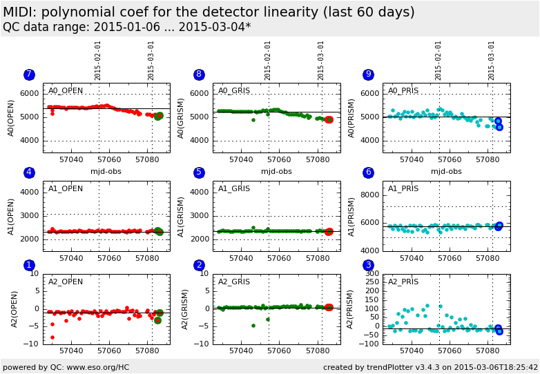
The linearity of the MIDI detector is an indicator if the quality of its response curve. The pipeline calculate the coefficients of the polynomial fit of the average pixel value (over a windowed area) of the detector for 3 different configurations (image, prism and grism). The polynomial fit is: I(t) = A_0 + A_1 * t + A_2 * t^2, where I is the detector level in ADU and t the time in millisecond.  


General information

Click on any of the plots to see a close-up version.

If applicable, the latest values from Paranal ops logs are plotted as blue dots. More information about those values, including a download option, is available in the OPSLOG section on top of the page.

The latest date is indicated on top of the plot, data points belonging to that date are specially marked.

If configured,

  • statistical averages are indicated by a solid line, and thresholds by broken lines
  • outliers are marked by a red asterisk. They are defined as data points outside the threshold lines
  • "aliens" (= data points outside the plot Y limits) are marked by a red arrow ( or )
  • you can download the data for each parameter set if the 'Data downloads' link shows up