Plot
? |
Symb
? |
Source
* |
Average ? |
Thresholds ? |
N_
data |
QC1
parameter |
Data
downloads |
Remarks |
| method |
value |
unit |
method |
value |
| 1 |
o | QC1DB |
MEDIAN |
0.969 |
fraction |
VAL | 0.90,1.05 |
15 |
conta4 |
this |
last_yr |
all
|
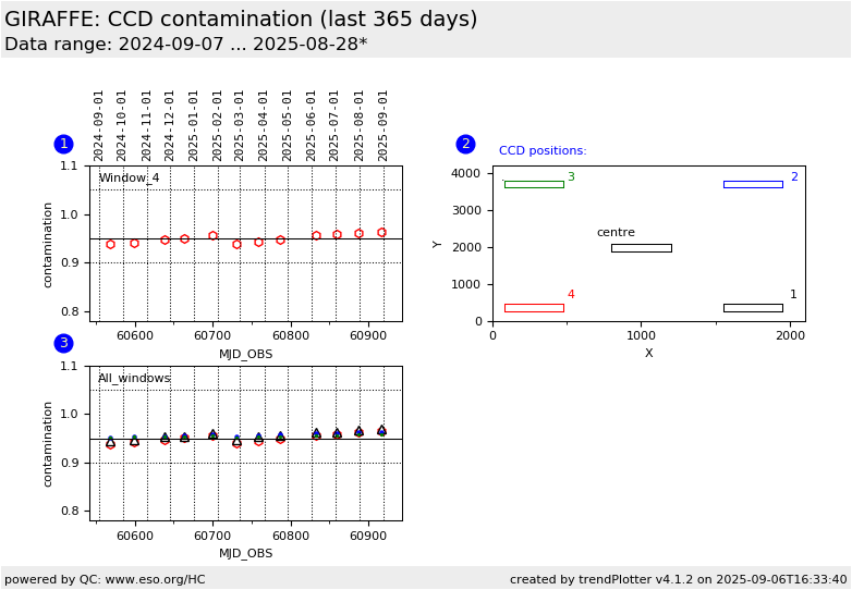
contamination measure of lower left corner (window 4) |
| 2 |
• | QC1DB |
none |
|
px |
none | |
15 |
conta4 |
|
static plot to indicate positions of contamination windows |
| 3 |
o | QC1DB |
MEDIAN |
0.969 |
fraction |
VAL | 0.90,1.05 |
15 |
conta4 |
this |
last_yr |
all
|
All four windows combined. Window 4 |
| 3 |
Δ | QC1DB |
none |
|
NONE |
none | |
15 |
conta1 |
this |
last_yr |
all
|
window 1 |
| 3 |
• | QC1DB |
none |
|
fraction |
none | |
15 |
conta2 |
this |
last_yr |
all
|
window 2 |
| 3 |
• | QC1DB |
none |
|
fraction |
none | |
15 |
conta3 |
this |
last_yr |
all
|
window 3 |
| |
|
*Data sources: QC1DB: QC1 database; LOCAL: local data source
|
Plot 1
scores:  1| 1|
| | data source: | giraffe_ccd
(QC1 database) |
| dataset: | conta4 | o |
| median: | 0.969 | fraction |
| fixed thresholds: | 0.9...1.05 | fraction |
| N_data plotted: | 15 |
| [click plot for closeup] |
Plot 2
scores: not implemented
| | data source: | giraffe_ccd
(QC1 database) |
| dataset: | conta4 | • |
| average: | none |
| thresholds: | none |
| N_data plotted: | 15 |
| [click plot for closeup] |
Plot 3
scores: not implemented
| | data source: | giraffe_ccd
(QC1 database) |
dataset:
(numbers below apply to this dataset) | conta4 | o |
| median: | 0.969 | fraction |
| fixed thresholds: | 0.9...1.05 | fraction |
| N_data plotted: | 15 |
| [click plot for closeup] |
This is the trending plot for the monitoring of the GIRAFFE
detector noise parameters, derived from image flats. These data are taken
about monthly.
This plot trends the contamination measurements. The image flat with the
highest exposure time is taken, its flux is measured in the five windows
marked in plot 2, and normalized to the center (meaning the central box has
always intensity 1 in plot 3).
If contamination builds up,
the relative efficiency will go down. The GIRAFFE CCD has a typical
contamination pattern, with the lower left corner showing the strongest
effect. Its value is plotted red and emphasized by the connecting line.
A decontamination procedure should be applied when the red data start to
approach the value 0.9.
Other QC parameters related to detector properties
are trended in the same group.
General information
Click on any of the plots to see a close-up version.
The latest date is indicated on top of the plot.
If configured,
- data points belonging to the latest date are specially marked
- statistical averages are indicated by a solid line, and thresholds by broken lines
- outliers are marked by a red asterisk. They are defined as data points outside the
threshold lines
- "aliens" (= data points outside the plot Y limits) are marked by a red arrow (↑ or ↓)
- you can download the data for each parameter set if the 'Data downloads' link shows up
|
