Do-it-yourself Science — is Proxima c hiding in this graph?
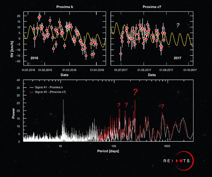
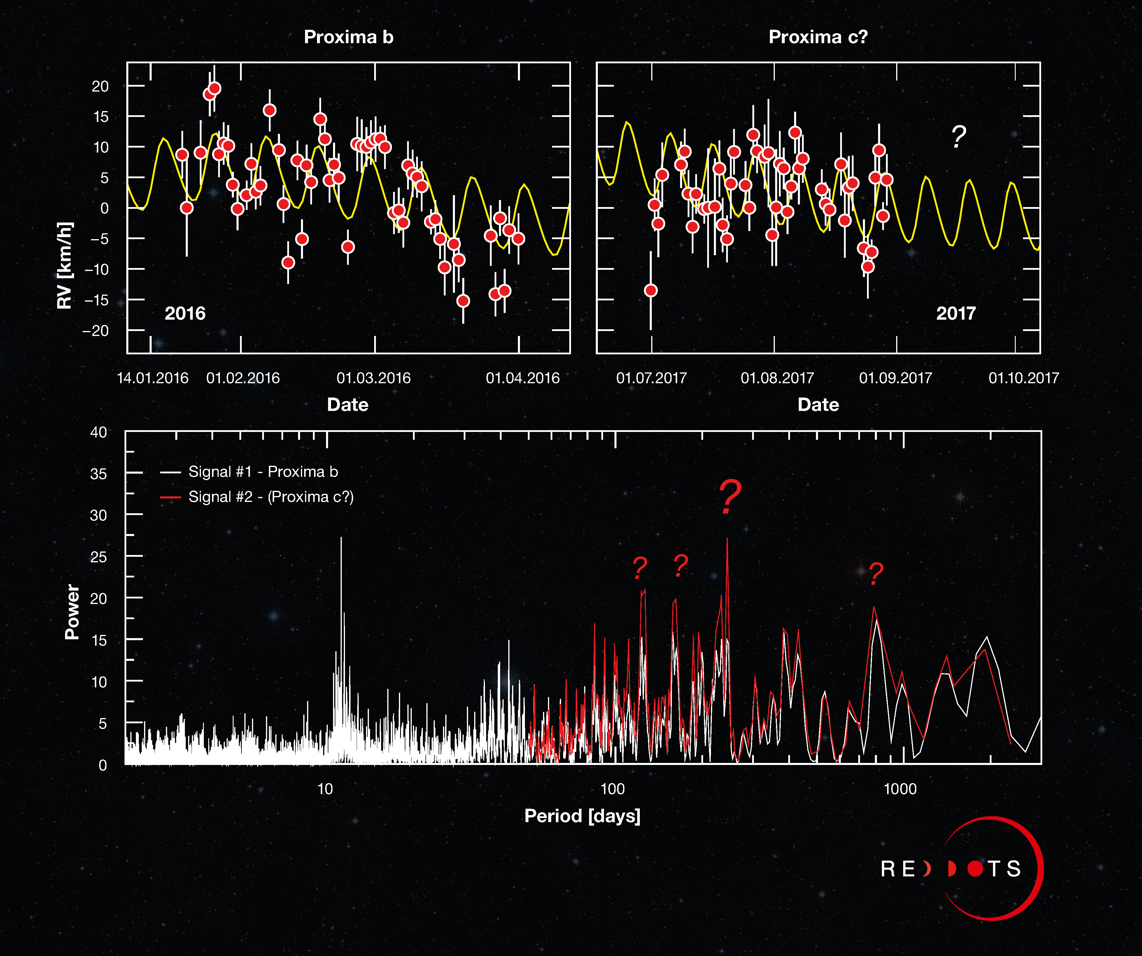
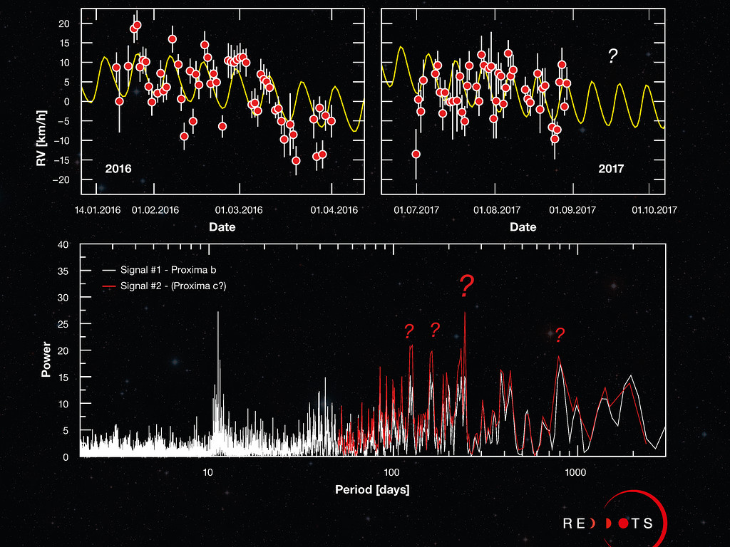
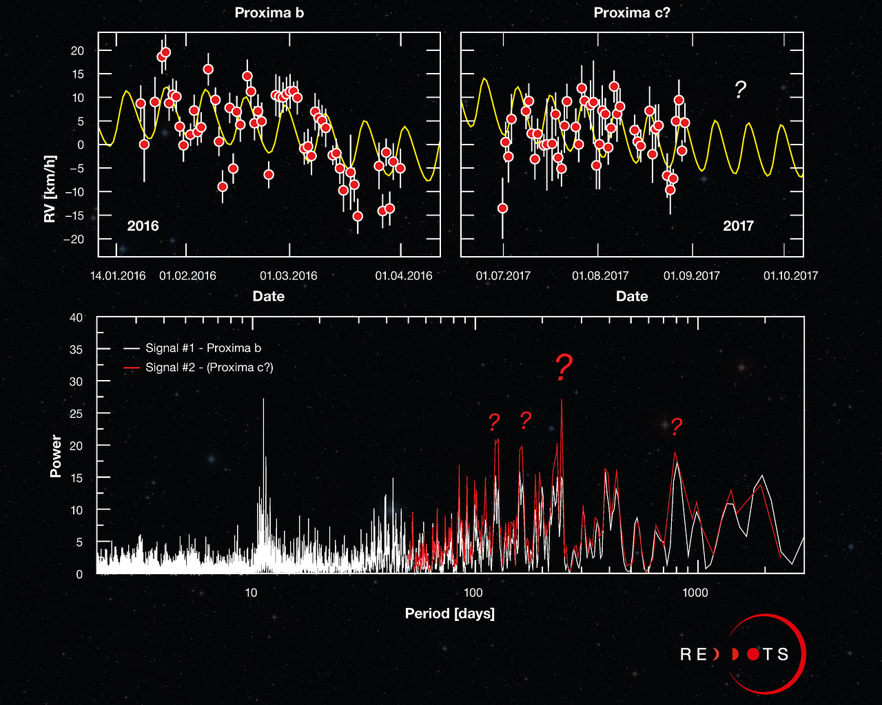
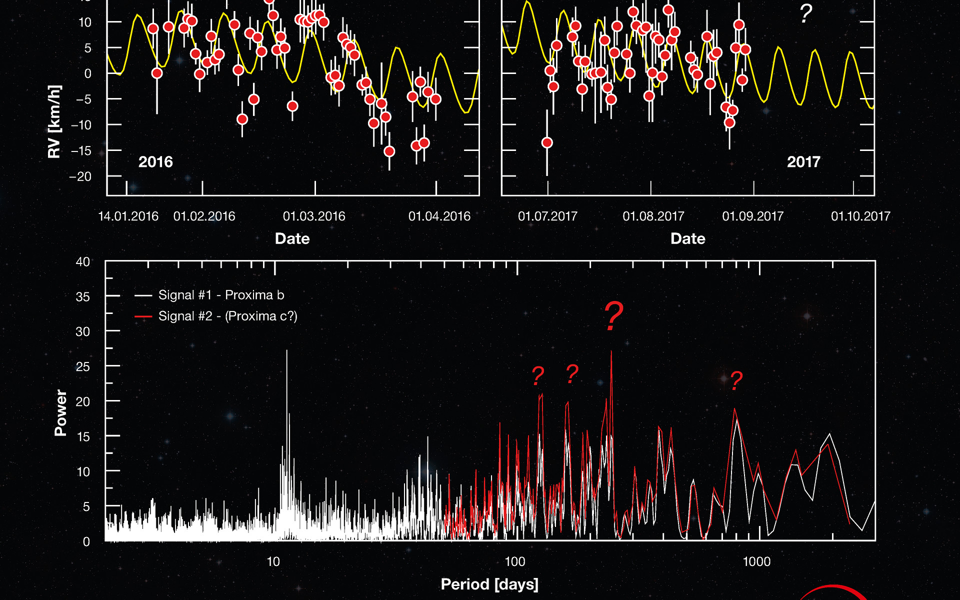
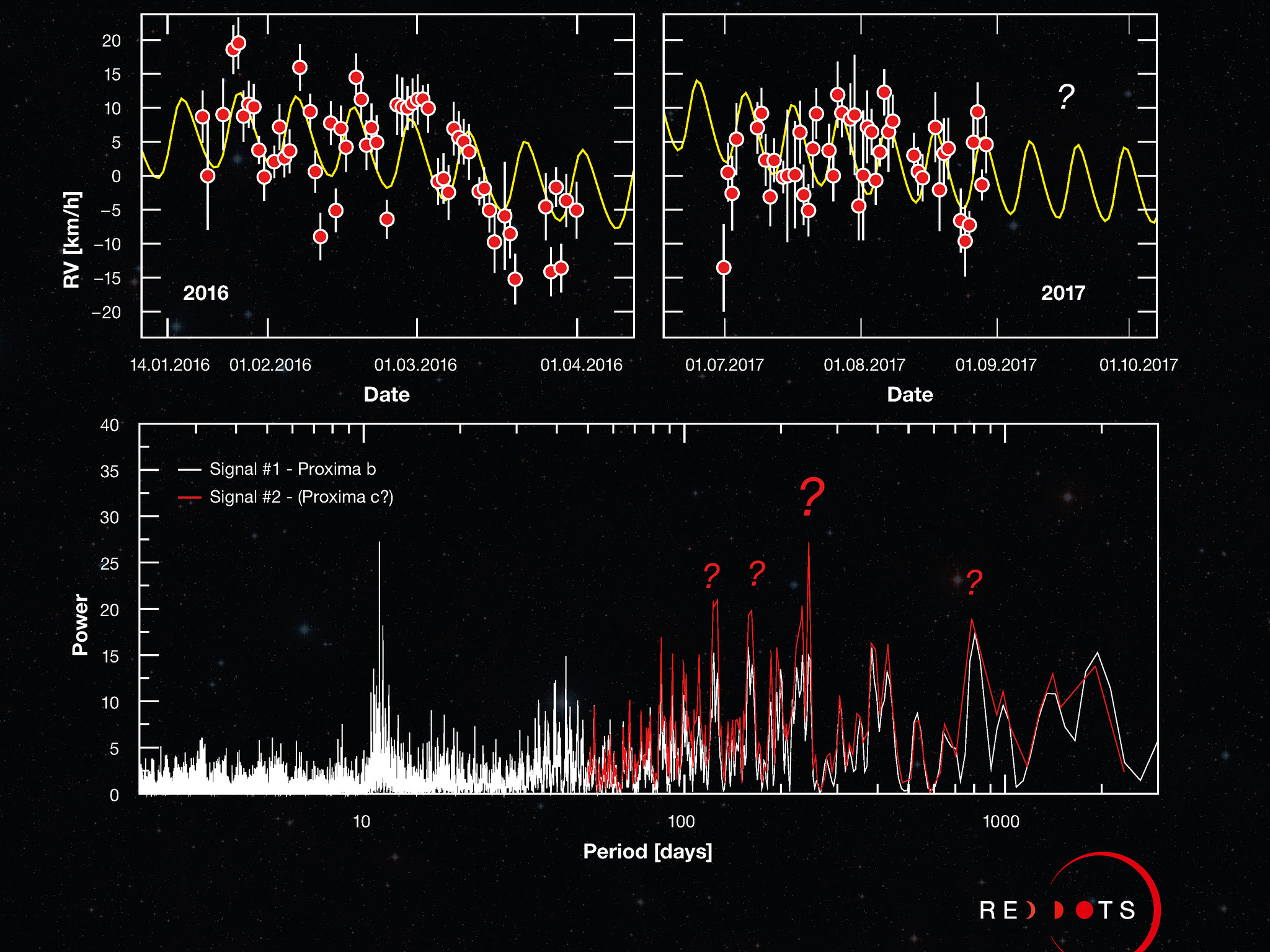
This unusual Picture of the Week showcases the latest data gathered by ESO’s exoplanet hunter, the High Accuracy Radial velocity Planet Searcher (HARPS), during the ongoing Red Dots campaign, a search for terrestrial planets around our nearest three red dwarf stars: Proxima Centauri, Barnard’s Star, and Ross 154. The campaign was launched earlier in 2017 to build on the 2016 discovery of Proxima b around our nearest stellar neighbour, Proxima Centauri. Red Dots is designed as an open notebook science experiment, meaning the public has access to the data and can even contribute observations. Can you see a new exoplanet in these data of Proxima Centauri?
By carefully tracing the movement of a star over time, graphs like these can reveal the presence of exoplanets. Just as a star pulls on its orbiting planets using gravity, planets pull on the star, causing the star to wobble and shift the wavelength of its light by a small but measureable amount. By analysing the predictable, repeating changes, astronomers can infer the presence of a planet. The top left graph displays the 2016 data that confirmed the existence of Proxima b, showing how the planet is causing its parent star, Proxima Centauri, to move towards and away from Earth over time. The curved line represents the wobbling signal of the star, with the regular pattern of changing radial velocities (RV) repeating every 11.2 days.
The top right graph shows new measurements made with HARPS during the Red Dots campaign. The new data once again confirms Proxima b’s signal (in yellow), but also includes additional data patterns — visible here as a downward slope in both the 2016 and 2017 data points — hinting that there may be more to be discovered. To make a firmer statement on what is causing these patterns, astronomers need to use quantitative mathematical tools.
One such mathematical tool is called a periodogram, which searches for repeating signals in the data — displayed here as prominent peaks — that indicate the presence of a planet. The graph on the bottom panel shows the periodogram for the new data. The first signal (in white) corresponds to Proxima b. The second set of possible periods (in red), of around 200 days, are produced from patterns seen in the top panels. The presence of multiple peaks of similar heights means a signal cannot be precisely pinpointed and that its origin remains unclear.
The project will continue acquiring measurements until the end of September this year. You can follow along as the Red Dots campaign unfolds and even contribute observations via the Red Dots website, Facebook, or Twitter accounts.
Credit:ESO/G. Anglada-Escudé
About the Image
| Id: | potw1737a |
| Type: | Chart |
| Release date: | 11 September 2017, 11:55 |
| Size: | 3916 x 3278 px |
About the Object
| Name: | Proxima Centauri |
| Type: | Milky Way : Star : Circumstellar Material : Planetary System |
| Distance: | 4 light years |
| Category: | Exoplanets |
Our use of Cookies
We use cookies that are essential for accessing our websites and using our services. We also use cookies to analyse, measure and improve our websites’ performance, to enable content sharing via social media and to display media content hosted on third-party platforms.
ESO Cookies Policy
The European Organisation for Astronomical Research in the Southern Hemisphere (ESO) is the pre-eminent intergovernmental science and technology organisation in astronomy. It carries out an ambitious programme focused on the design, construction and operation of powerful ground-based observing facilities for astronomy.
This Cookies Policy is intended to provide clarity by outlining the cookies used on the ESO public websites, their functions, the options you have for controlling them, and the ways you can contact us for additional details.
What are cookies?
Cookies are small pieces of data stored on your device by websites you visit. They serve various purposes, such as remembering login credentials and preferences and enhance your browsing experience.
Categories of cookies we use
Essential cookies (always active): These cookies are strictly necessary for the proper functioning of our website. Without these cookies, the website cannot operate correctly, and certain services, such as logging in or accessing secure areas, may not be available; because they are essential for the website’s operation, they cannot be disabled.
Functional Cookies: These cookies enhance your browsing experience by enabling additional features and personalization, such as remembering your preferences and settings. While not strictly necessary for the website to function, they improve usability and convenience; these cookies are only placed if you provide your consent.
Analytics cookies: These cookies collect information about how visitors interact with our website, such as which pages are visited most often and how users navigate the site. This data helps us improve website performance, optimize content, and enhance the user experience; these cookies are only placed if you provide your consent. We use the following analytics cookies.
Matomo Cookies:
This website uses Matomo (formerly Piwik), an open source software which enables the statistical analysis of website visits. Matomo uses cookies (text files) which are saved on your computer and which allow us to analyze how you use our website. The website user information generated by the cookies will only be saved on the servers of our IT Department. We use this information to analyze www.eso.org visits and to prepare reports on website activities. These data will not be disclosed to third parties.
On behalf of ESO, Matomo will use this information for the purpose of evaluating your use of the website, compiling reports on website activity and providing other services relating to website activity and internet usage.
Matomo cookies settings:
Additional Third-party cookies on ESO websites: some of our pages display content from external providers, e.g. YouTube.
Such third-party services are outside of ESO control and may, at any time, change their terms of service, use of cookies, etc.
YouTube: Some videos on the ESO website are embedded from ESO’s official YouTube channel. We have enabled YouTube’s privacy-enhanced mode, meaning that no cookies are set unless the user actively clicks on the video to play it. Additionally, in this mode, YouTube does not store any personally identifiable cookie data for embedded video playbacks. For more details, please refer to YouTube’s embedding videos information page.
Cookies can also be classified based on the following elements.
Regarding the domain, there are:
- First-party cookies, set by the website you are currently visiting. They are stored by the same domain that you are browsing and are used to enhance your experience on that site;
- Third-party cookies, set by a domain other than the one you are currently visiting.
As for their duration, cookies can be:
- Browser-session cookies, which are deleted when the user closes the browser;
- Stored cookies, which stay on the user's device for a predetermined period of time.
How to manage cookies
Cookie settings: You can modify your cookie choices for the ESO webpages at any time by clicking on the link Cookie settings at the bottom of any page.
In your browser: If you wish to delete cookies or instruct your browser to delete or block cookies by default, please visit the help pages of your browser:
Please be aware that if you delete or decline cookies, certain functionalities of our website may be not be available and your browsing experience may be affected.
You can set most browsers to prevent any cookies being placed on your device, but you may then have to manually adjust some preferences every time you visit a site/page. And some services and functionalities may not work properly at all (e.g. profile logging-in, shop check out).
Updates to the ESO Cookies Policy
The ESO Cookies Policy may be subject to future updates, which will be made available on this page.
Additional information
For any queries related to cookies, please contact: pdprATesoDOTorg.
As ESO public webpages are managed by our Department of Communication, your questions will be dealt with the support of the said Department.